14 Beadboard Backsplash Kitchen Ideas for Charm
There is a particular kind of kitchen that feels welcoming the moment you walk into it. Not the showroom kitchen with its glossy surfaces and perfectly aligned hardware, not the magazine kitchen with its styled produce arranged on a marble counter, but the kitchen that feels like it has been cooked in and gathered in and lived in for years. The kind that smells faintly of something good even when nothing is on the stove. These kitchens almost always share something in their material choices, a preference for surfaces with texture and warmth over surfaces that are smooth and impersonal. The beadboard backsplash is one of the most effective and most historically resonant ways to bring exactly that quality of warmth and character to the wall behind the counter and the stove.
Beadboard has been a feature of American domestic architecture for over a century, appearing on porch ceilings, mudroom walls, cottage interiors, and the working kitchens of farmhouses where its durability and visual warmth were equally valued. Its return to kitchen design is not nostalgia for its own sake but recognition that the qualities that made it appealing originally, its texture, its warmth, its ability to add architectural interest without overwhelming a space, are qualities that contemporary kitchens genuinely need. These fourteen beadboard backsplash ideas cover every application, every kitchen style, and every design challenge this enduring material can be called upon to solve.
1. Classic White Beadboard for the Cottage Kitchen
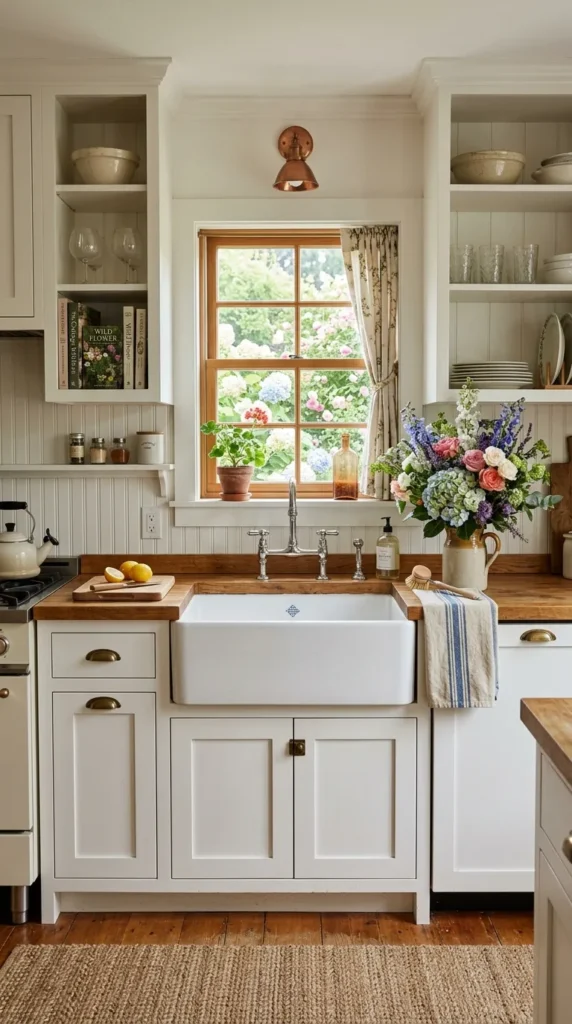
White painted beadboard on the kitchen backsplash captures what this material does best. The white paint unifies the vertical grooves into a single clean surface that reads as bright and fresh from across the kitchen while revealing, at closer inspection, the texture and depth of the paneling’s repeated bead detail. This is a quality that white tile and white painted drywall simply do not have, because those surfaces are genuinely flat in a way that beadboard’s subtle relief prevents it from being. The vertical lines also create a sense of height that suits lower ceilings particularly well, drawing the eye upward and making the kitchen feel taller than it actually is.
The practical consideration with white painted beadboard is the paint itself. A high quality semi gloss or gloss enamel in a pure or warm white, applied in multiple coats over a properly primed surface, creates a finish that is washable, moisture resistant, and durable enough to stay fresh through years of kitchen use. The grooves between planks need attention during cleaning. A narrow brush or a cloth wrapped around a butter knife reaches into the depth of the grooves and removes accumulated grease before it builds up to a level that becomes genuinely difficult to address. White beadboard cleaned regularly this way maintains its crisp quality indefinitely and never needs replacing for reasons of wear, only for reasons of wanting something different.
2. Painted Beadboard in a Deep Saturated Color
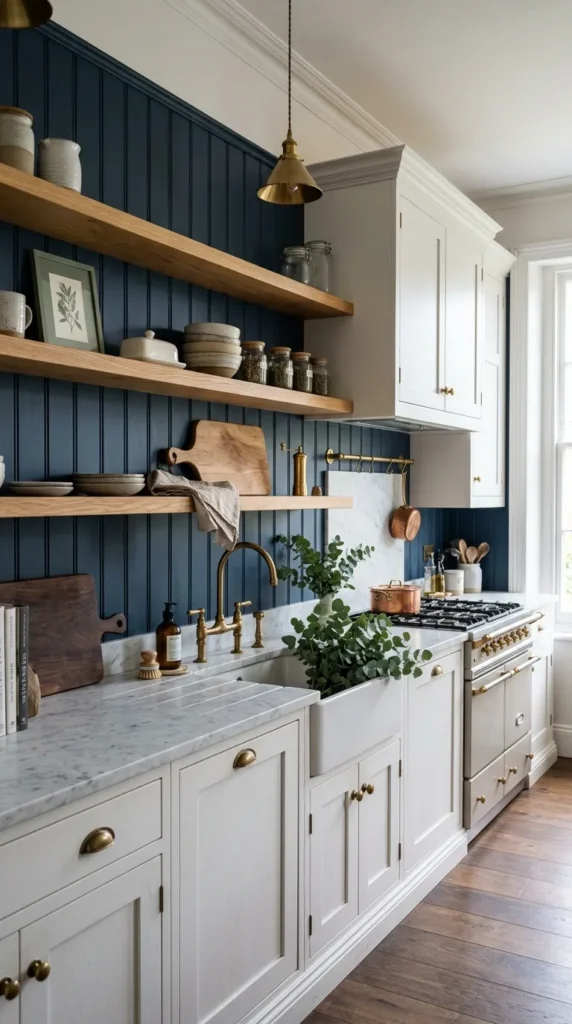
Beadboard reaches its most dramatically beautiful expression when painted in a deep saturated color rather than white or cream. Deep navy behind white or cream cabinets creates a composition of nautical elegance that suits coastal and traditional kitchens equally. Forest green with brass hardware and natural timber open shelving creates a richly layered botanical quality. Charcoal or near black with white marble counters and polished nickel hardware creates a sophisticated dramatic contrast that reads as genuinely designed from every angle in the room.
Color selection requires thinking about the beadboard not in isolation but in the context of every surface surrounding it simultaneously. A deep color on the backsplash creates the strongest visual impact when the surrounding surfaces are lighter and more neutral. Deep navy reads most beautifully against white or cream cabinets, not against already dark cabinetry where it would disappear rather than create the contrast that makes the color choice worth making. Use the same semi gloss or gloss enamel finish for deep colors as for white beadboard. The slight sheen enriches deep tones in a way that matte paint cannot, adding a quality of depth and luminosity that makes the backsplash appear to glow slightly in the kitchen’s light.
3. Beadboard Combined With Open Shelving Above
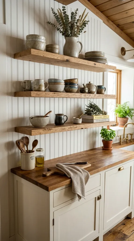
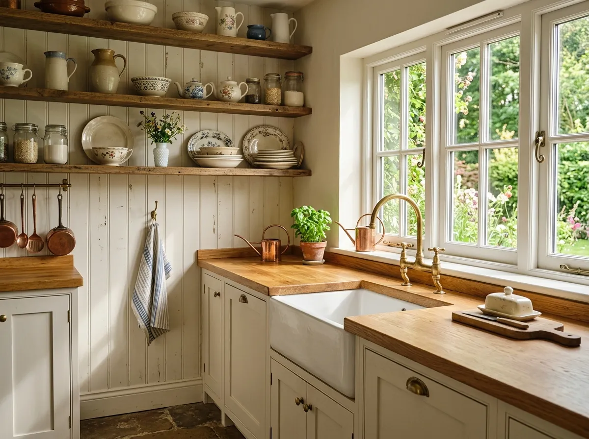
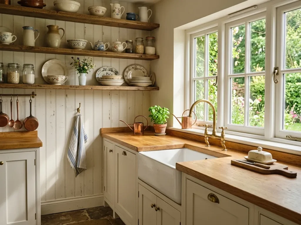
One of the most beautiful kitchen configurations combines a beadboard backsplash with open timber shelving mounted directly against it. The beadboard serves as a backdrop of textured warmth that makes every object on the shelves look more beautiful. Plates and glasses and ceramic bowls read against the vertical texture with a clarity and presence that a plain painted wall cannot match, because the beadboard’s subtle relief creates depth in the background that enhances rather than competes with the objects in the foreground.
Shelves whose depth suits the objects they display, approximately 25 to 30 centimeters for plates and bowls and 20 centimeters for glasses and smaller ceramics, mounted at heights that allow comfortable reach and generous visual space between levels, work practically as well as they look aesthetically. The timber species chosen for the shelves should relate to the beadboard color. Warm walnut or pale oak suits cream or warm white beadboard. Lighter timber works beautifully against deep colored beadboard where the contrast creates a material and color richness that defines the kitchen’s entire character.
4. Beadboard Backsplash Extended to Ceiling Height
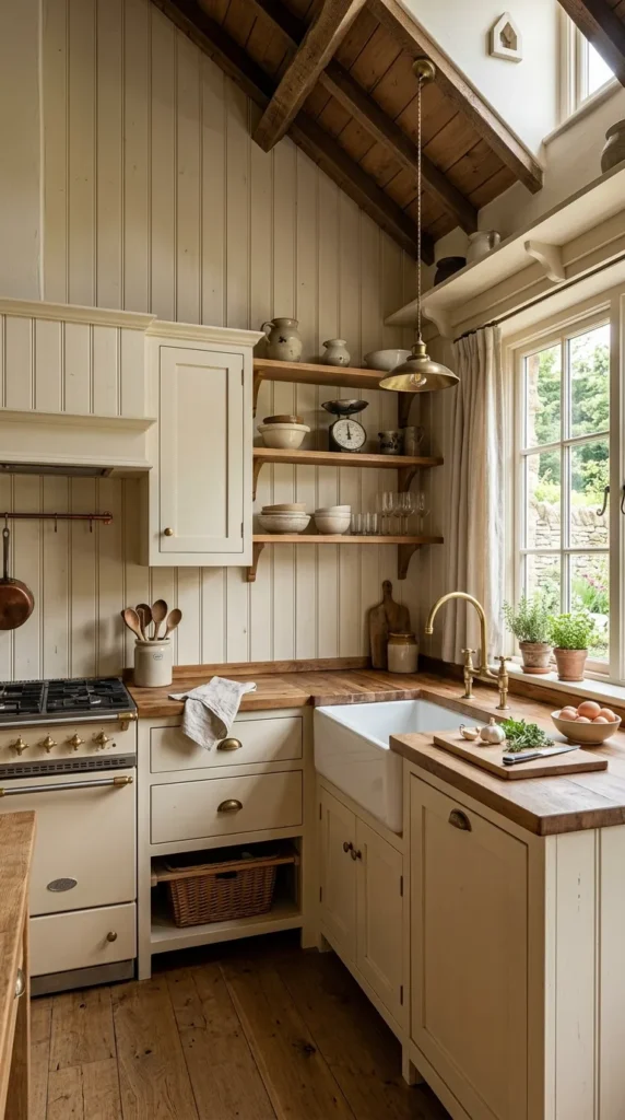
The conventional beadboard backsplash runs from countertop to the bottom of the upper cabinets, roughly 45 to 60 centimeters. But beadboard extended beyond this zone, running from countertop to ceiling in the spaces between and above upper cabinets, or running floor to ceiling on a wall with no upper cabinets at all, transforms the material from a backsplash detail into a defining architectural feature of the entire room. Full height beadboard creates a sense of genuine architectural investment that the standard installation cannot approach, because the material’s presence becomes unavoidable rather than merely charming.
The kitchen that benefits most from full height beadboard is one that needs architectural interest its existing structure does not provide. A newer home with plain drywall and no molding, or a galley kitchen whose long unbroken wall needs the visual rhythm of beadboard’s repeated panels to prevent it from feeling flat and institutional. Full height beadboard painted in warm white or gentle cream creates a kitchen that feels like it could have existed a century ago, in the best possible sense, a kitchen with genuine architectural bones that modern construction typically lacks. Cap the top with a simple chair rail or picture rail molding to give the installation a finished and intentional quality that distinguishes it from beadboard that simply runs to the ceiling without a designed conclusion.
Planning a complete kitchen refresh? Explore 14 Black and White Kitchen Countertops Ideas for timeless countertop inspiration.
5. Horizontal Beadboard for a Coastal Kitchen
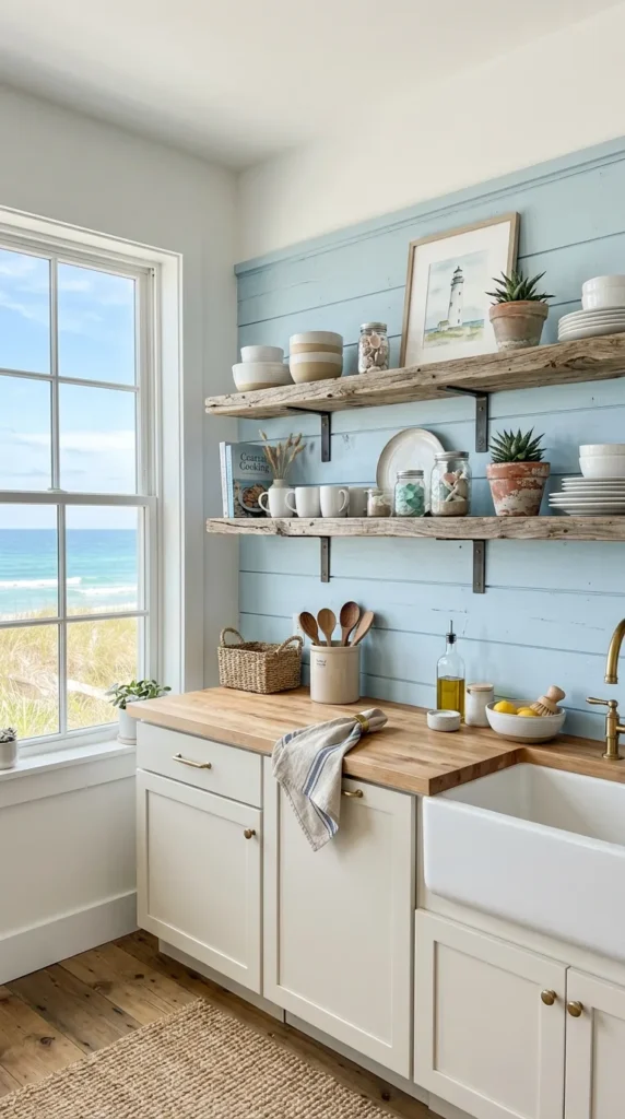
While beadboard is most commonly installed with planks running vertically, a horizontal installation creates a completely different visual quality that suits coastal and beach house kitchen aesthetics with particular naturalness. Horizontal beadboard references the ship lap and tongue and groove paneling of boat interiors and seaside architecture, the horizontal boarding of coastal cottages, and the weatherboarding of buildings designed to withstand salt air and moisture. The horizontal lines also draw the eye along the wall rather than upward, creating a sense of width that suits kitchens whose width is more generous than their height.
The color that suits horizontal beadboard in a coastal kitchen is not always white. Some of the most beautiful horizontal beadboard kitchens use a soft weathered blue grey, a pale driftwood tone, or a warm sandy cream that references the specific colors of the coastal environment more directly and more subtly than stark white. Combine this with natural timber open shelves, rope handled cabinet hardware, linen window treatments, and ceramic vessels in ocean influenced tones. The grey greens and blue whites and sandy neutrals of beach glass and salt worn pottery create the coastal atmosphere that overt nautical decoration can never quite deliver because it tries too hard and achieves too little.
6. Beadboard With Subway Tile Above the Stove
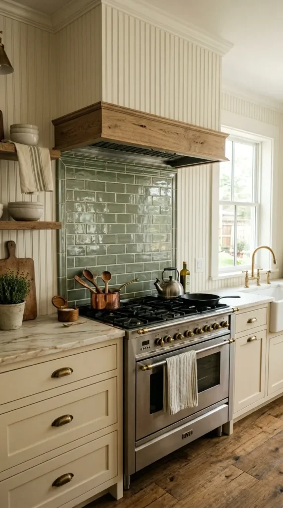
Combining beadboard as the primary backsplash with subway tile specifically in the area above and around the stove creates a layered backsplash treatment that suits the practical reality of kitchen use more honestly than either material alone. The area directly behind the stove is the most demanding zone for any backsplash, exposed to the highest heat, the most intense splashing, the most concentrated grease and steam. Subway tile’s fired ceramic surface handles all of these conditions with more durability than painted beadboard. Using tile in this demanding zone while using beadboard throughout the rest gives each material its most appropriate role.
The design success of this combination depends on how the two materials meet. A deliberate frame around the subway tile area, a simple timber molding or a border tile in a coordinating material, creates a composition that reads as intentional rather than as an awkward junction between two materials that could not decide which should take priority. Classic white subway tile in a running bond pattern suits white or light colored beadboard and creates a fresh composition whose variety of surface texture prevents it from reading as monotonous. A colored subway tile in warm sage, deep navy, or soft terracotta creates a more dramatic focal point above the stove that suits deep colored beadboard or provides the accent color that a white beadboard kitchen needs to prevent its neutrality from becoming blandness.
7. Beadboard in a Farmhouse Kitchen With Shaker Cabinets
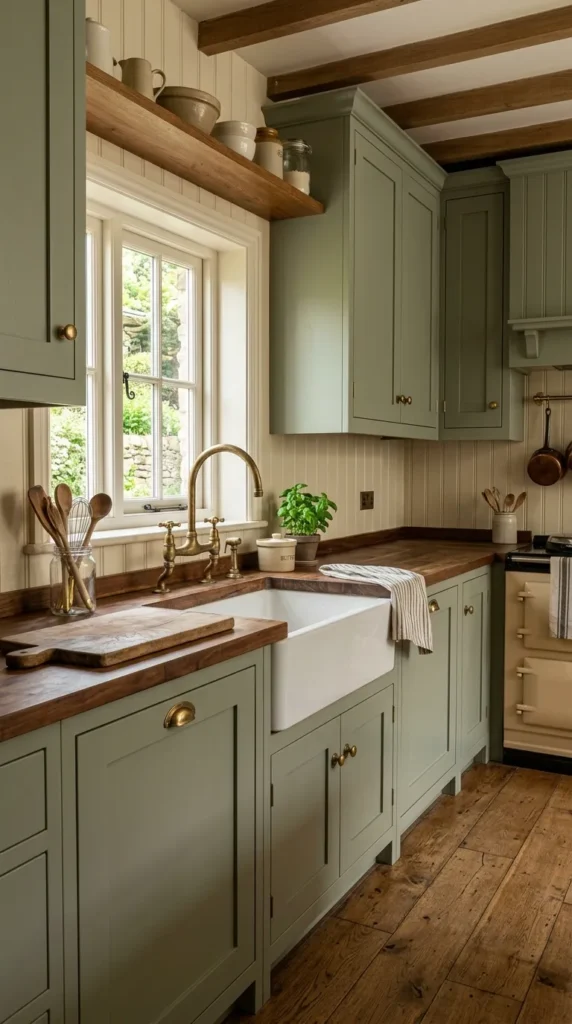
The pairing of beadboard with Shaker style cabinets is one of the most naturally harmonious combinations in kitchen design because both belong to the same design philosophy. The American vernacular tradition values honest construction, simple geometry, quality materials, and the beauty of well made functional objects. Shaker cabinets with their recessed panel doors and absolute absence of ornamental detail share beadboard’s quality of expressing beauty through texture and proportion rather than through applied decoration. Together they create a kitchen whose character is one of quiet confident integrity that more elaborate kitchen designs rarely achieve.
The color relationship between beadboard and Shaker cabinets gives the farmhouse kitchen most of its visual character, and the options are more varied than the all white farmhouse kitchen that has become the default interpretation of the style. White beadboard behind white Shaker cabinets creates a unified kitchen whose character comes entirely from the texture of its surfaces. Cream beadboard behind sage green Shaker cabinets creates a botanical warmly colorful farmhouse kitchen of extraordinary appeal. Deep navy beadboard behind cream Shaker cabinets creates a farmhouse kitchen of dramatic sophisticated contrast that suits the style’s traditional roots while feeling entirely contemporary in its confidence.
8. Beadboard in a Small Kitchen for Visual Interest
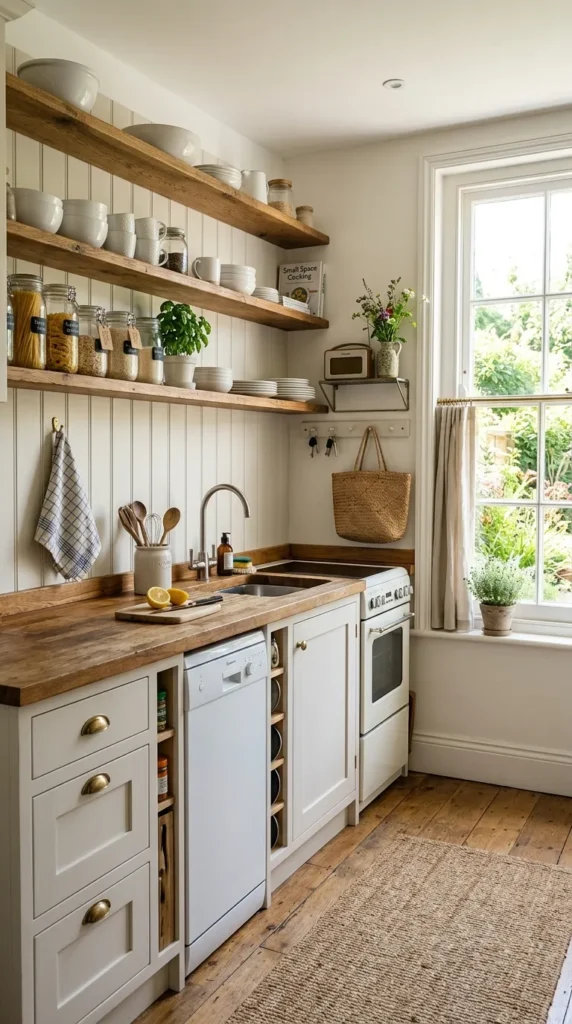
Beadboard navigates the small kitchen’s design challenges with unusual grace. Its vertical texture is subtle enough to read as calm and undemanding from across a small space while being rich enough to provide genuine visual interest at the closer distances a small kitchen inevitably involves. It adds character and warmth without the visual weight of stone or the complexity of a patterned tile, and its vertical emphasis creates the height enhancing effect that small kitchens need more urgently than large ones.
Color is more consequential in a small kitchen because the limited wall area means the beadboard’s color contributes a higher proportion of the room’s overall color impression. A pale warm white or cream maximizes the sense of light and space while still providing the textural warmth and architectural character that distinguish beadboard from plain painted walls. If color is desired, and color in small kitchens is often more successful than people expect, choose a single muted slightly grayed tone for the beadboard and keep all other surfaces in coordinating light tones. A confidently colored small room feels more designed and more intentional than a nervously neutral one, and beadboard carries color with more grace than almost any other backsplash material available.
9. Beadboard Beside an Exposed Brick Feature Wall
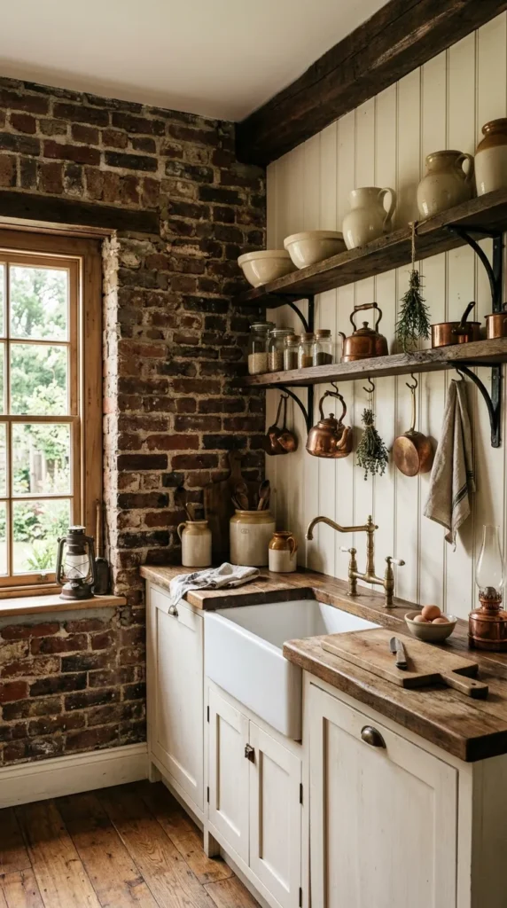
In a kitchen with exposed brick, beadboard on the adjacent walls creates a material composition of extraordinary warmth and layered historical character. The beadboard’s painted surface and regular geometry create a deliberate contrast with the brick’s irregular ancient deeply textured surface that makes both materials more interesting in each other’s presence. The brick reads as more genuinely old and more materially authentic against the clean painted beadboard, while the beadboard reads as more refined and more designed against the raw irregular brick. Together they create a kitchen that feels simultaneously raw and polished, historical and contemporary, industrial and domestic.
The beadboard color should be chosen in response to the brick’s specific tone, which varies enormously between different types and ages of brick from warm terracotta through deep reds and burnt oranges to cooler purplish reds in some older brick. A warm white or cream suits most brick colors by providing a clean bright contrast that allows the brick’s color and texture to read clearly without competition. A very pale sage or warm off white with green undertones suits brick with a more terracotta leaning color, creating a material conversation between the green grey of the beadboard and the warm orange red of the brick that references ivy covered walls and materials that have aged together in the same environment.
10. Beadboard With Vintage Hardware and Antique Accessories
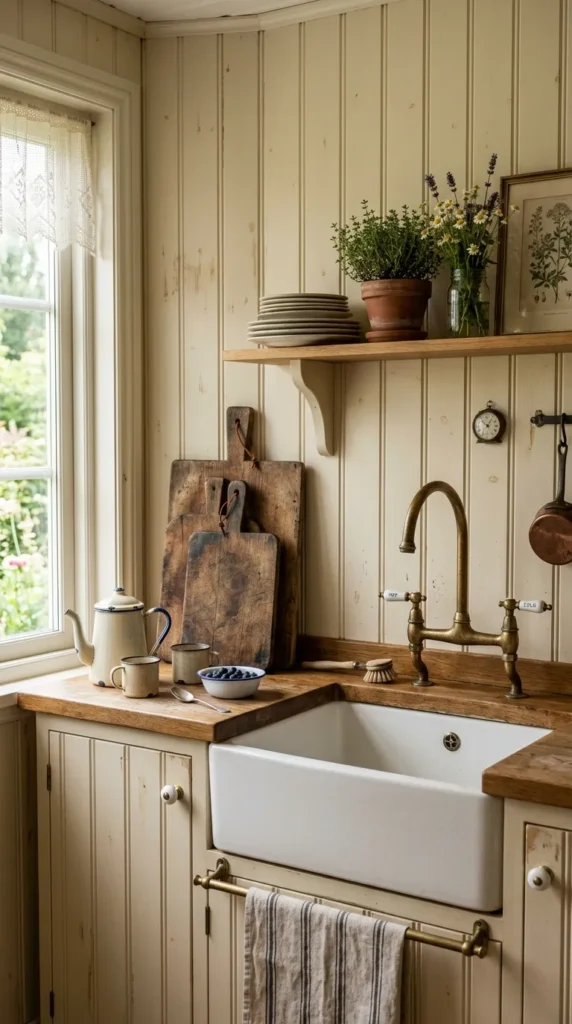
A beadboard backsplash reaches its fullest character in a kitchen whose hardware and accessories are chosen with the same commitment to warmth and material authenticity that the beadboard itself represents. A bridge style or gooseneck faucet in aged brass or oil rubbed bronze. Cabinet hardware in hand forged iron pulls or ceramic knobs with a slightly irregular handmade quality. A light fixture above the sink in aged metal whose finish has developed a patina through genuine or simulated age. Accessories on the counter and open shelves that are a mixture of vintage finds and genuinely old objects carrying the evidence of years of kitchen use in their surfaces.
The objects that suit this kind of beadboard kitchen share its quality of honest unpretentious materiality. Enamelware in cream or pale blue. Cast iron cookware whose surface patina carries decades of cooking history. Ceramic crocks in salt glaze or simple earthenware that hold utensils and dry goods in the traditional manner. Timber cutting boards worn smooth through years of use. Glass jars repurposed as storage for grains and spices. These objects do not need to be genuinely antique. Well made contemporary versions of traditional kitchen objects, chosen for their material honesty rather than their ability to appear old, suit a beadboard kitchen as naturally as the genuine article and can be found at every price point.
Make your kitchen even more functional with these 14 Kitchen Island Layout Ideas for beautiful and practical layouts.
11. Beadboard in a Two Tone Kitchen for Color Contrast
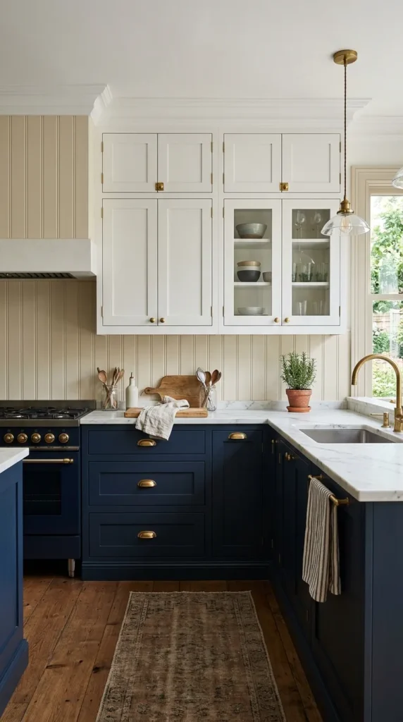
The two tone kitchen, where upper and lower cabinets are painted in different colors creating a horizontal division at counter height, is one of the most design forward kitchen configurations available. A beadboard backsplash in the zone between the two cabinet colors creates a three layer composition of material and color richness without requiring any single element to do more than its share of the work. In a kitchen with white upper cabinets and deep navy lower cabinets, a cream beadboard backsplash creates a warm bright band of material interest that separates the two colors and prevents the composition from reading as a hard abrupt division.
The practical design question is whether the beadboard’s color should be neutral, relating to neither cabinet color specifically, or whether it should reference one of the cabinet colors and create a deliberate relationship between backsplash and one set of cabinets. A neutral beadboard in white, cream, or very pale warm grey creates the most flexible and most balanced result, allowing the two cabinet colors to read clearly and distinctly without the backsplash pulling the composition toward either one. A beadboard that references one cabinet tone, a slightly lighter or darker version of the upper cabinet color, creates a more specific color relationship that suits kitchens where one cabinet color is clearly intended as the room’s primary palette choice.
12. Painted Beadboard With a Stenciled Pattern
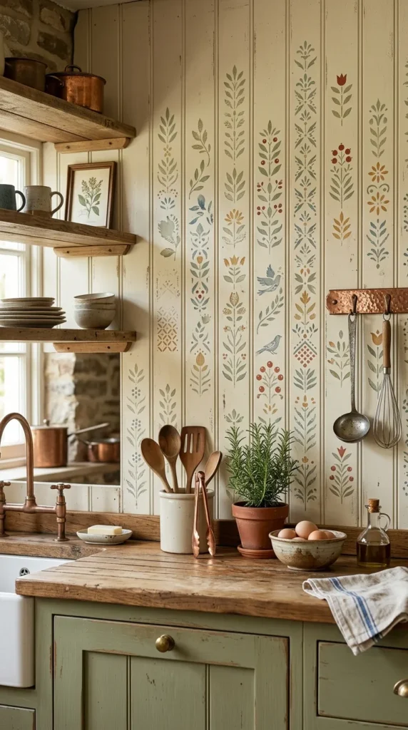
A beadboard backsplash enhanced with a stenciled pattern creates a kitchen backsplash of extraordinary individuality that no manufactured tile can replicate, because stenciling is by definition a one of a kind intervention that carries the slight imperfections and individual quality of hand application. A simple geometric stencil, a repeated diamond or a simple tile like grid, applied in a tone just slightly darker or lighter than the base color creates a subtle tone on tone pattern that adds visual interest at close range while reading as a richly textured single colored surface from across the kitchen. A more contrasting stencil, a botanical motif in deep green on a cream base or a geometric pattern in gold on a deep blue base, creates a bolder statement that gives the backsplash the visual impact of an expensive hand painted tile at a fraction of the cost.
Stenciling on beadboard requires more patience than stenciling on a flat wall because the grooves interrupt the stencil at regular intervals and require careful technique to bridge cleanly. The most successful approach uses a very small amount of paint on the stencil brush in multiple light passes rather than a single heavy application, which prevents the excess paint that causes bleeding and blurring at the groove edges. A stencil pattern chosen to relate to the beadboard’s panel width, one whose repeat aligns with or deliberately spans the panel joints, creates a result that looks designed rather than improvised, as if the stencil pattern and the panel structure were conceived together.
13. Beadboard in a Butler’s Pantry or Prep Area
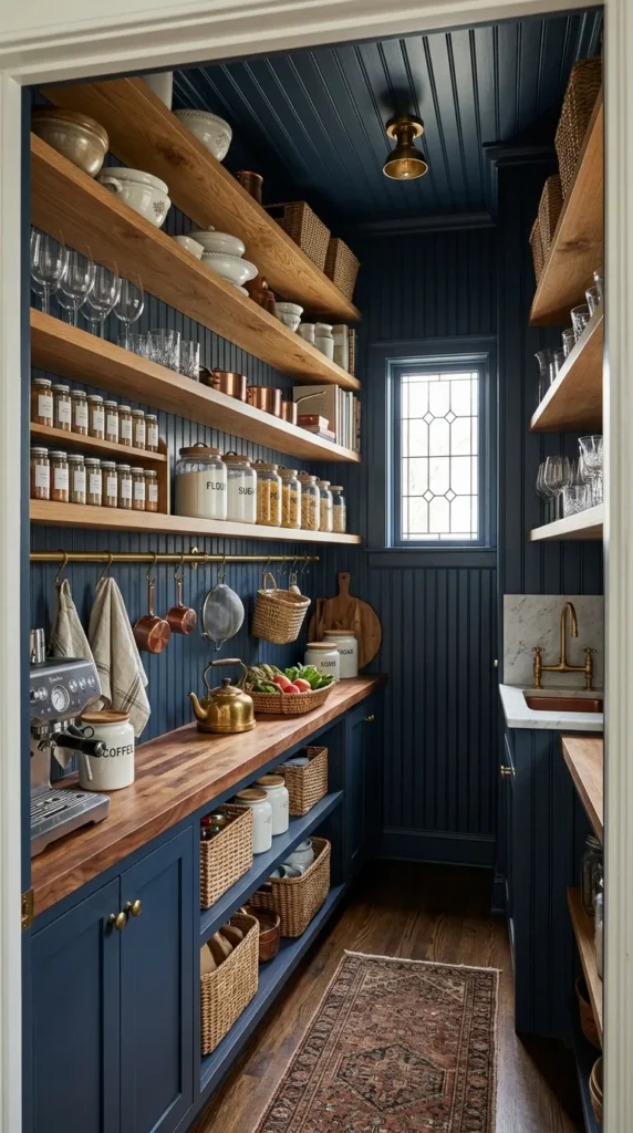
The butler’s pantry is one of the kitchen spaces where beadboard is most completely at home, because the butler’s pantry’s character is precisely the character that beadboard most naturally creates. A working practical beautifully organized space that combines the warmth of traditional domestic architecture with the functional seriousness of a room designed to support genuine hospitality. Beadboard on the walls of a butler’s pantry, from counter height to ceiling or floor to ceiling on walls without cabinetry, creates the traditional gracious character that distinguishes a proper butler’s pantry from merely an additional counter space or a glorified storage cupboard.
The butler’s pantry does not need to coordinate as precisely with the main kitchen’s aesthetic as the main kitchen’s own elements must relate to each other, and this freedom allows the beadboard to express a slightly different character. A main kitchen in white Shaker cabinetry might have a butler’s pantry in navy beadboard with open timber shelving, a bolder more intimate version of the same design direction that suits the smaller more enclosed scale of the secondary space. Fit the butler’s pantry beadboard walls with picture rail molding at the top and with peg rail or Shaker rail at a useful height below. These are traditional storage solutions perfectly suited to beadboard walls that add organizational functionality to the beautiful material character the beadboard already provides.
14. Beadboard in an All White Kitchen for Subtle Texture
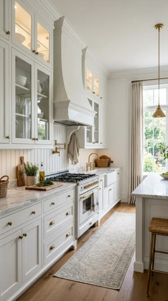
The all white kitchen faces one central challenge. Without color variation to create visual interest, the room’s quality depends entirely on the variation of texture and material between its surfaces. A kitchen whose white surfaces are all smooth flat and similar in finish creates a visual monotony that is clean but lifeless, easy to look at because it asks nothing of the eye but failing to engage because it gives the eye nothing to discover. White beadboard on the backsplash of an all white kitchen resolves this challenge by introducing the textural variation the monochromatic scheme requires while maintaining the color unity that makes the all white kitchen work.
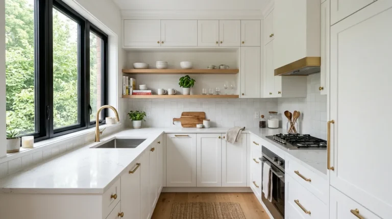
White beadboard is most effective in an all white kitchen when its paint finish creates a deliberate distinction from the other white surfaces. A semi gloss or gloss finish on the beadboard against matte or eggshell finishes on the cabinet doors and walls creates a finish contrast that makes the beadboard’s texture visible and its presence legible from across the kitchen without introducing any color variation that would break the room’s white unity. The vertical grooves catch light differently from flat cabinet surfaces, creating a play of light and shadow across the backsplash zone that gives the all white kitchen exactly the visual life it needs. Pair white beadboard with natural timber open shelves, brass hardware throughout, and a single stone counter in warm white or cream marble to create an all white kitchen of genuine material richness that reveals more the longer you look at it.
Making Beadboard Work in Your Kitchen
The decision to use beadboard as a kitchen backsplash is a decision to prioritize warmth, character, and architectural interest over the smooth sealed surfaces that most contemporary kitchen design defaults to. The practical requirements are real but manageable. Proper priming before painting, the right paint formulation for a moisture and grease prone environment, regular cleaning with attention to the grooves, and periodic repainting as the surface shows the evidence of years of kitchen use. None of these are more demanding than the maintenance requirements of other backsplash materials that come with their own specific cleaning challenges.
The beadboard kitchen that is maintained well ages beautifully. The paint develops the slight softness of a surface that has been used and cleaned and repainted over years. The material acquires the quality of something that belongs to the house rather than something recently installed. The kitchen as a whole develops the lived in warmth and genuine domestic character that newly renovated kitchens spend years waiting to earn. Choose beadboard for your kitchen backsplash with the confidence that it is one of the most historically proven and most genuinely charming choices available, and that the kitchen it creates will feel like a kitchen that has always been there, which is the highest compliment available to any material in any room of the home.