13 Living Room Color scheme That Work
Living room color decisions make people more anxious than almost any other design decision and the anxiety is usually disproportionate to the actual risk. Paint is reversible. A color that does not work can be painted over and the worst outcome is an afternoon of repainting and the cost of two cans of paint. What creates the anxiety is not the permanence of the decision but the uncertainty of how a color seen on a small chip will behave across four walls of a real room with real light and real furniture. That uncertainty is legitimate and the way to manage it is not to default to beige but to understand what makes color combinations work before choosing them.
Color combinations in a living room work when they create a relationship between colors that feels resolved rather than accidental. Two colors that belong together because they share a tonal temperature, or because one is the complement that makes the other look better, or because they were found together in a natural material that the room uses, create a room with visual coherence that colors chosen independently of each other rarely achieve. These 13 combinations cover the full range from the most accessible to the most ambitious with an explanation of why each one works rather than simply a description of what it looks like.
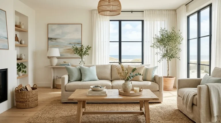
1. Warm White and Natural Timber
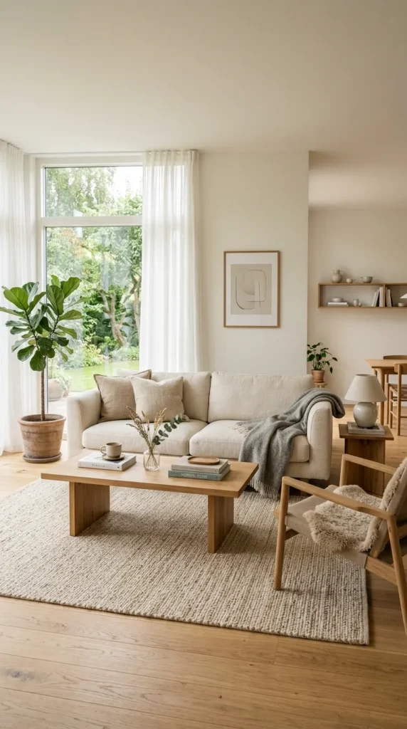
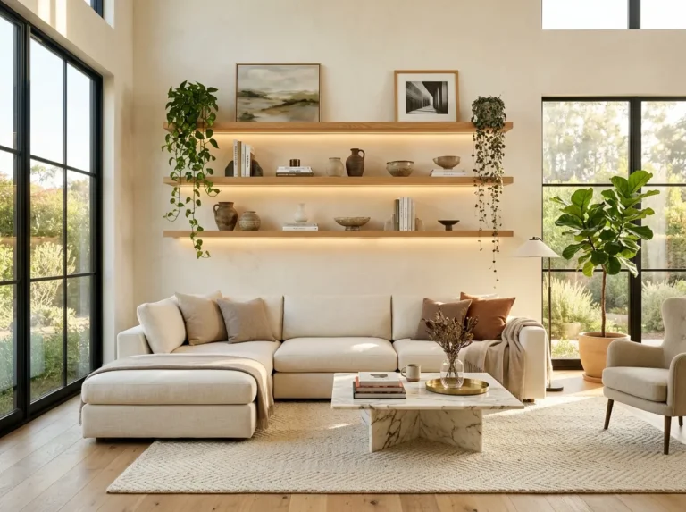
Warm white walls with natural timber, whether in the floor, the furniture, or the architectural details, is the foundation color combination that almost every other combination builds from. It is not a simple or unambitious choice despite appearing that way. The quality of the white matters enormously. A stark cool white with timber creates a material tension between the cool wall color and the warm timber that makes both look less beautiful than they should. A warm white with the slightest yellow or pink undertone creates a harmony with natural timber that allows both to be seen at their best.
The timber tone within this combination determines the room’s overall warmth. Pale ash and light oak create a room that feels bright and Scandinavian. Darker walnut and mahogany create a room with more depth and weight. Both versions work with warm white walls because warm white sits within the same tonal family as natural timber regardless of the specific timber’s depth. This is the most liveable and the most enduring color combination available to a living room and its simplicity is deceptive because getting the specific white right requires testing rather than assuming.
2. Sage Green and Warm Cream
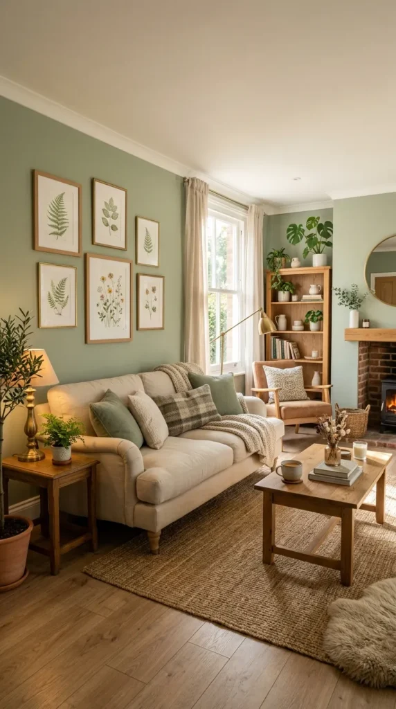
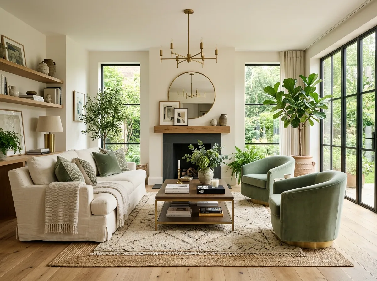
Sage green walls with warm cream in the upholstery, the rug, and the textiles create a living room with the quality of a garden in winter. The green is present but muted enough to feel restful rather than energetic and the warm cream prevents it from reading as cold or clinical in the way that a more saturated or cooler green might. This combination has appeared in well designed living rooms for decades without dating because both colors exist in nature in this relationship and natural color combinations have a permanence that trend colors do not.
The depth of the sage green determines the room’s atmosphere significantly. A pale sage at the lighter end of the range creates a room that feels airy and almost neutral with just enough color presence to read as a considered choice. A deeper sage approaching olive creates a room with more presence and more warmth that suits evening use better than daytime use. Both versions benefit from warm natural light that brings out the green’s warmth and from warm artificial light at the same 2700K temperature that prevents the green from pulling cool in the evening hours.
3. Navy Blue and Brass
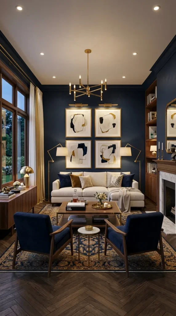
Navy blue walls with brass accents, lamp bases, curtain hardware, picture frames, and decorative objects, create a living room of considerable sophistication whose success comes from the specific warmth of brass against the depth of navy. Navy is one of the few very dark colors that creates warmth rather than coldness in a domestic context and brass amplifies that warmth rather than contradicting it. The combination is confident without being aggressive and creates a room that reads as genuinely designed rather than simply decorated.
The navy should cover the full room rather than one accent wall because the combination’s power comes from the enveloping quality of the dark color with warm brass points of light within it. An accent wall of navy with three neutral walls creates a room with one dark corner rather than a room with dark depth. Navy on all four walls with cream or warm white ceiling and trim creates the right proportion of dark to light. Cream linen upholstery on the sofa and chairs creates the necessary contrast between the dark walls and the primary seating without introducing a third color that the combination does not need.
Love timeless interiors? Explore 16 Vintage Living Room Ideas for classic design inspiration.
4. Terracotta and Forest Green
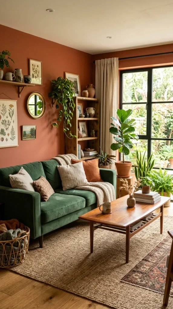
Terracotta and forest green are colors that appear together in the natural world in the relationship between warm clay earth and deep vegetation and they create the same quality of organic harmony in a living room that they create in nature. Neither color is fashionable in the trend sense. Both colors are beautiful in the enduring sense and the combination of the two creates a room with genuine warmth and genuine depth that purely neutral rooms cannot match.
The proportion between the two colors determines the room’s atmosphere. Terracotta as the wall color with forest green in the textiles, a green velvet sofa, green cushions, a green plant, creates a warm earthy room where the green provides relief from the warmth of the surrounding walls. Forest green walls with terracotta expressed through ceramic objects, a terracotta rug, and warm cushions creates a deeper and more atmospheric room where the terracotta provides the warmth that the green alone would lack. Both proportions work and the choice between them should be based on the room’s natural light, with the terracotta wall version better suited to darker rooms and the green wall version better suited to rooms with good natural light.
5. Warm Gray and Dusty Pink
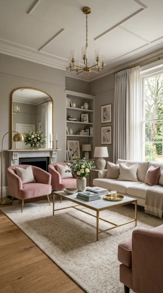
Warm gray and dusty pink create a color combination that is simultaneously sophisticated and genuinely warm in a way that either color achieves less completely alone. Warm gray on its own risks reading as cool and neutral despite its warm undertone. Dusty pink on its own risks reading as too obviously soft or too obviously feminine for a shared living room. Together the warm gray grounds the dusty pink and the dusty pink warms the gray and the result is a combination with a delicate balance that makes both colors look more considered than they do independently.
The key word in both colors is the qualifying adjective. Warm gray rather than cool gray and dusty pink rather than bright pink. The warmth in the gray and the dustiness in the pink place both colors in the same tonal family, slightly faded, slightly warm, slightly complex rather than pure. Colors that share this quality of slight complexity rather than pure saturation create harmonious combinations precisely because their complexity is similar even when their hues are different.
6. Deep Teal and Warm Copper
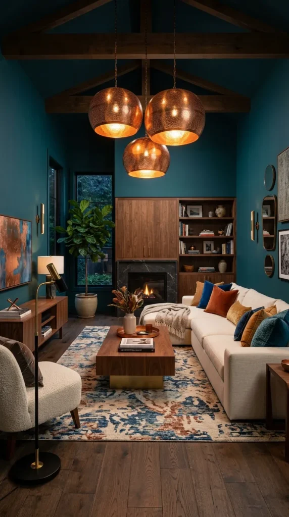
Deep teal and warm copper is a color combination that has a specific quality of richness and depth that comes from the relationship between a complex blue green and a warm metallic that sits opposite it on the color spectrum. The teal’s complexity, its blue and green qualities existing simultaneously, creates a color that responds differently to different light sources and that changes throughout the day in a way that simpler colors do not. The copper, whether in metallic accents or in rust toned textiles, provides the warmth that the teal’s complexity would otherwise lack.
This combination works best as a drenched room approach where the teal is used on walls and ceiling and the copper appears in accents, lamp shades, cushion covers, a copper toned rug, and decorative objects. The drench approach gives the teal the visual mass it needs to create the depth the combination is built on and the copper accents provide the warmth that prevents the dark teal from feeling cold or oppressive. White or cream trim keeps the room’s boundaries defined and prevents the dark walls from making the room feel shapeless.
7. Ochre Yellow and Deep Blue
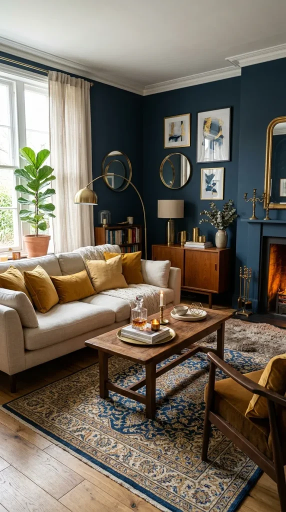
Ochre yellow and deep blue are colors that have been used together successfully across centuries of interior design because the relationship between warm yellow and cool blue creates a visual tension that is energizing rather than uncomfortable when the specific tones are chosen correctly. Ochre rather than bright yellow places the warm color in the earthy, slightly muted range that relates naturally to historical pigments. Deep navy or midnight blue rather than bright blue places the cool color in a depth that has weight and presence rather than the sharpness of saturated blue.
This combination works best when the ochre is used in the textiles and the blue in the walls rather than the reverse because ochre walls with blue accents creates a living room that feels almost Mediterranean in its warmth and energy which suits some rooms and overwhelms others. Blue walls with ochre in cushions, a rug with ochre patterning, warm yellow flowers in a vase, and brass accents that bridge both colors creates a more controlled version of the same combination that suits a wider range of living room contexts.
8. Charcoal and Warm White
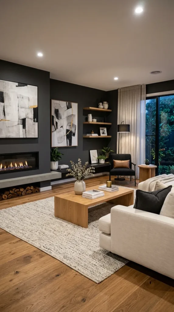
Charcoal and warm white is the high contrast combination that creates the most graphic and most contemporary of all the color combinations on this list. Charcoal walls with warm white ceiling, trim, and upholstery create a living room of considerable visual impact whose success depends entirely on the quality of the warm artificial light in the room. Under warm lighting charcoal walls glow and the combination creates a room of extraordinary atmosphere. Under cool overhead lighting the same combination feels institutional rather than dramatic.
The warm white elements in this combination must be genuinely warm rather than pure or cool white because the contrast between charcoal and cool white creates a coldness that undermines the combination’s intended drama. Cream linen rather than white cotton on the sofa. Off white walls rather than brilliant white ceiling. Warm white trim rather than stark brilliant white architraves. These specific warm whites create the right contrast with charcoal without the coldness that pure white introduces alongside a very dark wall color.
9. Dusty Lavender and Warm Timber
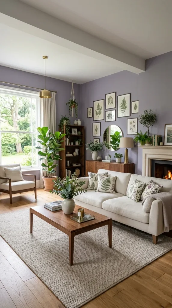
Dusty lavender is one of the least used and most beautiful colors available to a living room because its combination of purple and gray places it in a range that feels simultaneously unusual and completely restful. Against warm timber, whether in a floor, a shelf unit, or in furniture pieces, dusty lavender creates a living room with a quality of quiet beauty that no more common color combination achieves with the same ease. The timber’s warmth prevents the lavender from reading as cold or overly purple and the lavender’s unusual quality prevents the timber from looking generic.
This combination requires confidence in the paint testing stage because dusty lavender is highly sensitive to light direction and can read as gray, as pink, or as genuinely purple depending on the specific light conditions of the room. Testing large samples in the actual room over a full day of natural light variations and under the room’s specific artificial lighting confirms whether the specific lavender chosen creates the quality the combination is intended to achieve before the full room is painted.
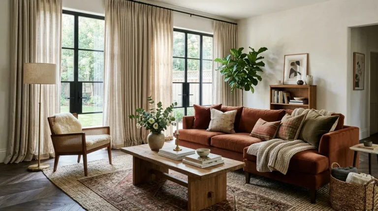
10. Rust and Cream
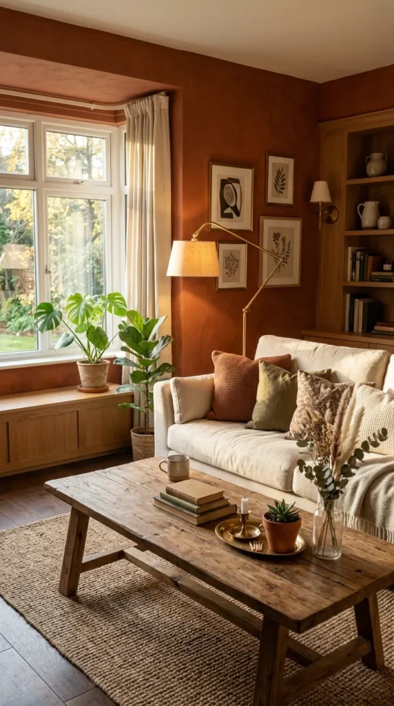
Rust and cream is an autumn color combination that works in living rooms because it creates warmth without the aggressiveness of brighter warm colors. Rust sits between terracotta and deep orange in a range that is saturated enough to have genuine presence but muted enough to feel domestic rather than energetic. Against cream in the upholstery and the ceiling the rust creates a room of genuine warmth that suits every season without feeling specifically autumnal when used in a natural material palette.
Rust works well as a wall color in rooms that face north or receive limited natural light because the warmth of the color compensates for the coolness of the light rather than adding warmth on top of existing warmth the way that warm colors in sunny rooms can become overwhelming. A cream sofa, natural timber accents, and brass hardware complete a rust and cream living room whose warmth comes from every surface simultaneously rather than from a single dominant color surrounded by neutrals.
Bring your color palette to life with these 14 Eclectic Living Room Ideas for bold and creative decorating inspiration.
11. Dark Green and Natural Linen
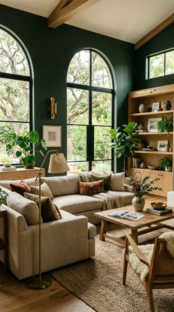
Dark green walls, whether forest green, bottle green, or deep olive, against natural linen in the upholstery and the textiles create a living room of organic richness that feels simultaneously bold and completely natural. The dark green provides the depth and drama and the natural linen provides the organic warmth that prevents the dark green from feeling too formal or too heavy. Plants in this combination are both obvious and completely right because living green plants against deep green walls create a layering of natural green tones that gives the room a quality of genuine lushness.
The linen in this combination should be genuinely natural in tone rather than bleached or bright white. Unbleached linen with its slight warm beige quality relates to the dark green in the same way that cream earth relates to deep vegetation in nature. Bleached or bright white linen against dark green creates a contrast that reads as deliberate rather than natural and changes the combination from organic warmth to graphic contrast which is a different and less easy result.
12. Warm Blush and Aged Brass
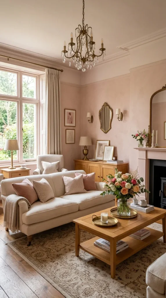
Warm blush walls with aged brass hardware, lamp bases, and decorative accents create a living room of gentle glamour that is more widely appealing than its description might suggest because the specific warmth of aged brass tones down the sweetness of blush pink in a way that polished chrome or matte black accents do not. The aged quality of the brass, its slightly darkened and slightly matte surface, belongs to the same tonal family as the muted warmth of blush and the two together create a combination that reads as considered and warm rather than sweet or feminine.
Natural timber furniture in a warm honey tone extends the warm palette of blush and aged brass without introducing a fourth color element. A room of blush walls, honey timber, aged brass accents, and cream linen upholstery contains only warm tones from the same tonal family and the cohesion of that tonal consistency creates a living room with the quality of unified warmth that multi color palettes rarely achieve regardless of how carefully each individual color is chosen.
13. Black and Natural Materials
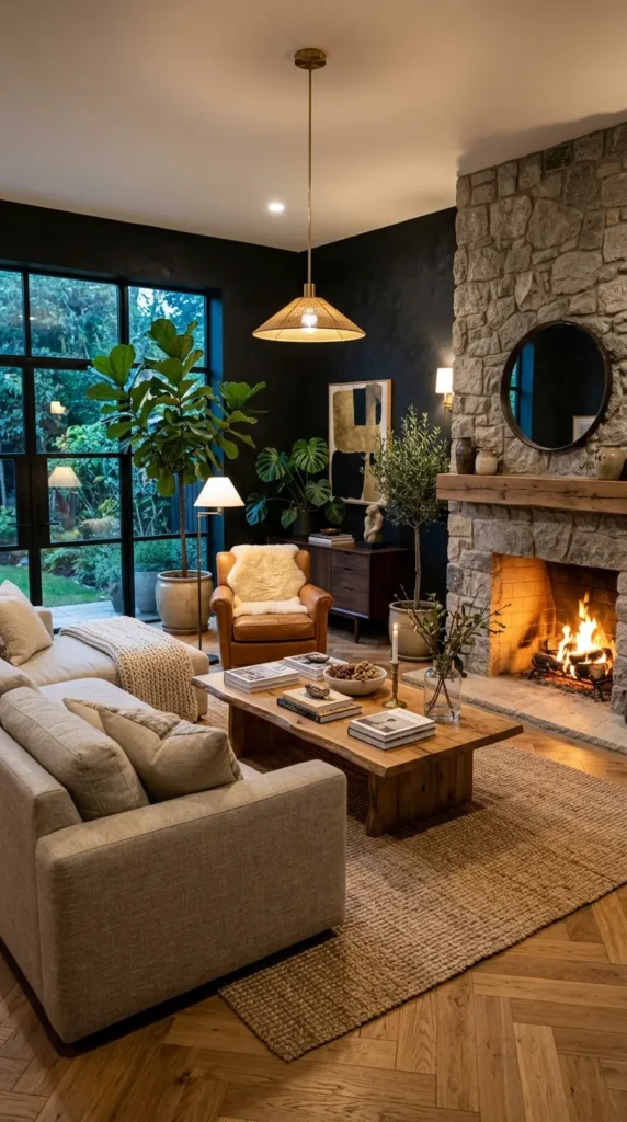
Black used in a living room as the wall color or as a dominant surface color against genuinely natural materials, real timber, natural stone, linen, jute, creates a combination of extraordinary richness and visual confidence. The natural materials prevent the black from reading as cold or aggressive because their organic warmth sits against the depth of the black in the same way that natural light creates warmth within darkness. The combination is bold but not harsh and creates a living room of genuine visual intelligence.
The natural materials in this combination must be genuinely natural rather than materials that imitate natural qualities. Real timber rather than timber effect laminate. Natural stone rather than porcelain stone effect tile. Genuine linen rather than polyester linen look fabric. The distinction matters in a combination where the natural material’s genuine quality is the element that makes the black walls work rather than overwhelming the room and that quality cannot be replicated by materials designed to look like something they are not.
Final Thoughts
A living room color combination that works is one chosen with understanding of why those specific colors belong together rather than chosen from a trend board or a magazine photograph whose room conditions, light quality, material selection, and proportions may be completely different from the room the combination is being applied to. The why of a color combination is what makes it transferable. The what, the specific colors in a specific photograph, is context dependent and cannot simply be copied.
Test every combination at genuine scale in the actual room before committing. Two large paint samples on adjacent walls observed across a full day of light changes and under the room’s specific artificial lighting reveal how the combination will actually behave in that specific context. That test is the most valuable design investment available before any living room paint decision and the hour it takes saves the afternoon of repainting that assumptions without testing sometimes require.