17 Color Drenched Dining Rooms Done Right
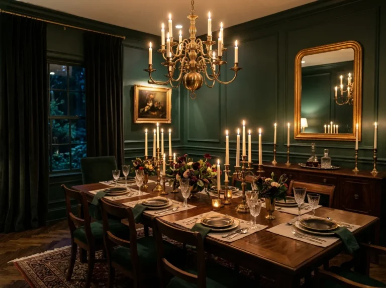
Most dining rooms play it safe and most dining rooms are forgettable. I have eaten in dozens of beige and white dining spaces and I genuinely cannot tell them apart in my memory. Then a few years ago I walked into a dining room where every surface, walls, ceiling, trim, even the built in cabinet, was painted the same deep forest green. No breaks, no contrast, just one color holding the entire room together. I stood there for a moment before sitting down because the room itself felt worth paying attention to. That has never happened to me in a greige dining room.
Color drenching done right is not about picking a bold shade and slapping it on a wall. It is about full commitment. It is painting the ceiling the same color. It is extending the shade to the trim instead of leaving it white. It is choosing furniture and textiles that work within the color rather than against it. When those decisions come together the room stops feeling like a room with colored walls and starts feeling like a destination. These 17 dining rooms show exactly how that is done across a wide range of colors, budgets, and styles. Every single one of them is memorable for the right reasons.
1. Terracotta Done Right With Every Surface Matching
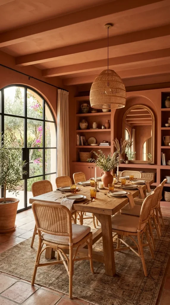
The terracotta drench works because the color is warm enough to feel welcoming even at full saturation. When walls, ceiling, and trim all share the same terracotta shade the room feels settled and complete rather than intense.
What makes this done right is the extension to trim. Most people paint the walls and leave the trim white, which breaks the immersion completely. Painting everything the same color removes that visual interruption and lets the room breathe as one unified space. Layer in natural rattan, warm linen, and simple brass and you have a dining room that looks like it cost three times what it actually did.
2. Cobalt Blue With White Ceramics That Pop Against It
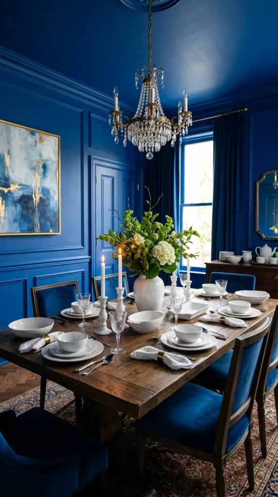
Cobalt blue is one of those colors that looks slightly terrifying in a paint chip and absolutely spectacular on four walls with a ceiling to match. The depth of the color is what makes it work at drench level because it creates a richness that lighter blues cannot achieve.
Done right this means keeping everything on the table and the floor simple so the color can carry the room. White ceramic plates and bowls against cobalt walls create a contrast that looks intentional and considered. Natural wood chairs prevent the room from feeling too cool. The ceiling in the same cobalt is what separates a well done drench from a room that just has a blue wall.
3. Forest Green Extended Down to the Skirting Boards
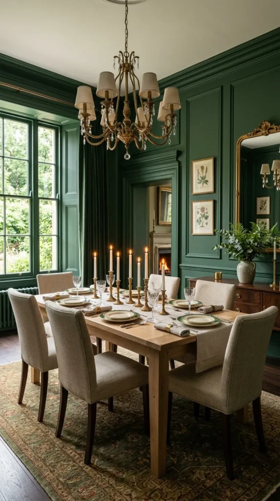
Forest green as a full drench including the skirting boards and floor level trim is one of the most satisfying color treatments a dining room can receive. Taking the color all the way to the floor removes the visual interruption that trim creates and lets the green fill the room completely.
This is done right when the furniture is simple and the materials are natural. A pale oak table, linen chairs, and a few brass candlesticks are genuinely all a forest green drenched room needs. The color does the rest. It makes everything inside it look better than it would in a neutral room because it creates a backdrop with actual presence.
Pair bold paint colors with statement walls by exploring 19 Dining Room Wall and Wallpaper Ideas for extra design inspiration.
4. Inky Black Drench With Warm Layered Lighting
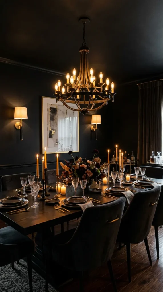
A black drenched dining room done right comes down almost entirely to the lighting. The color itself is not difficult. Matte black paint on four walls and a ceiling is straightforward. What separates a successful black drench from a room that feels like a cave is warm light coming from multiple sources at different heights.
Pendant lights with warm bulbs overhead, candles on the table, a wall sconce or two along the sides. Together these create a layered warmth that makes the black walls glow rather than absorb. The room feels dramatic and alive rather than heavy. Done this way a black drenched dining room is the most impressive on this list.
5. Deep Plum That Looks Different at Every Hour
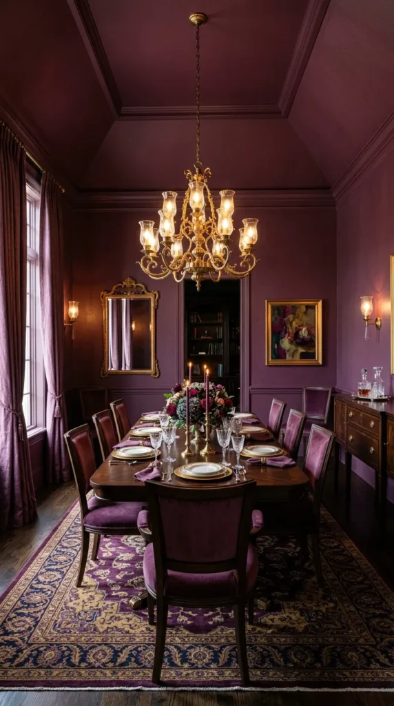
Plum and aubergine are color drench choices that genuinely earn their place on this list because they are so responsive to changing light. The same plum drenched room can look warm and reddish over morning coffee and deeply purple and mysterious over dinner with candles.
Done right means choosing a plum that sits closer to the warm side of the spectrum rather than a cold blue purple. The warm plum creates a room with richness and intimacy. Pair with dark walnut furniture, aged brass fixtures, and heavy linen curtains in a similar tone and the layering creates a dining room with more atmosphere than rooms twice its size.
6. Saffron Yellow Drench That Makes Food Look Spectacular
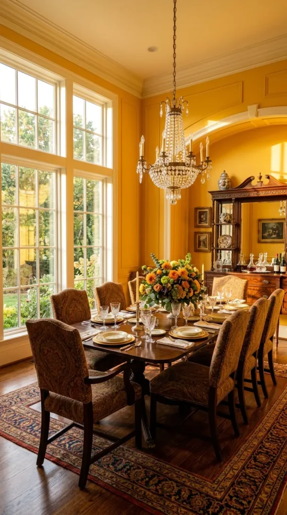
Saffron yellow is the bravest choice on this list and when done right it is one of the most rewarding. A full drench in warm saffron creates a dining room with more energy than any neutral could dream of generating.
What makes saffron done right is controlling the tone carefully. Too orange and the room feels fast food. Too pale and it loses the immersive quality that makes the drench work. The right saffron is deeply warm and rich. Food looks vivid and alive against it. Guests are more animated in saffron rooms than in any other color. There is genuine research behind this but honestly you can feel it the moment you walk in.
7. Burnt Orange With Built Ins Painted to Disappear Into the Walls
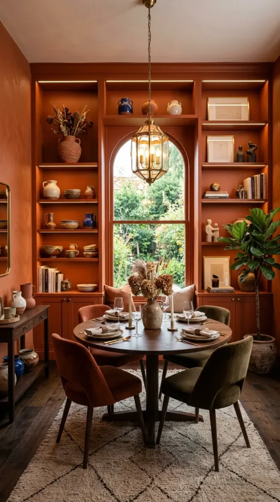
Burnt orange as a complete drench including any built in joinery creates a dining room where the architecture disappears and the color takes over entirely. When a sideboard or shelving unit is painted the same burnt orange as the walls it stops being furniture and becomes part of the room itself.
Done right the objects displayed on those built ins seem to float against the color rather than sit on a unit. Ceramics, glassware, and books all look more interesting when the thing holding them has dissolved into the background. This is a practical trick that costs nothing extra and creates a result that looks genuinely designed.
8. Peacock Teal From Floor to Ceiling With Brass Everywhere
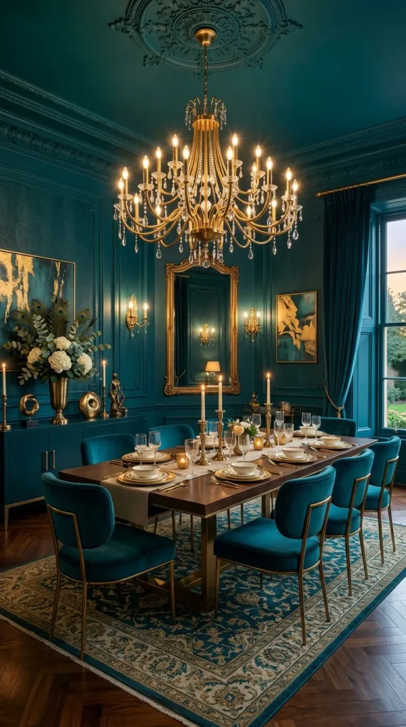
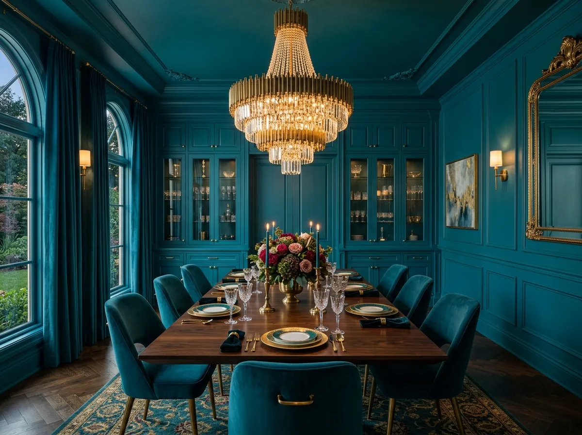
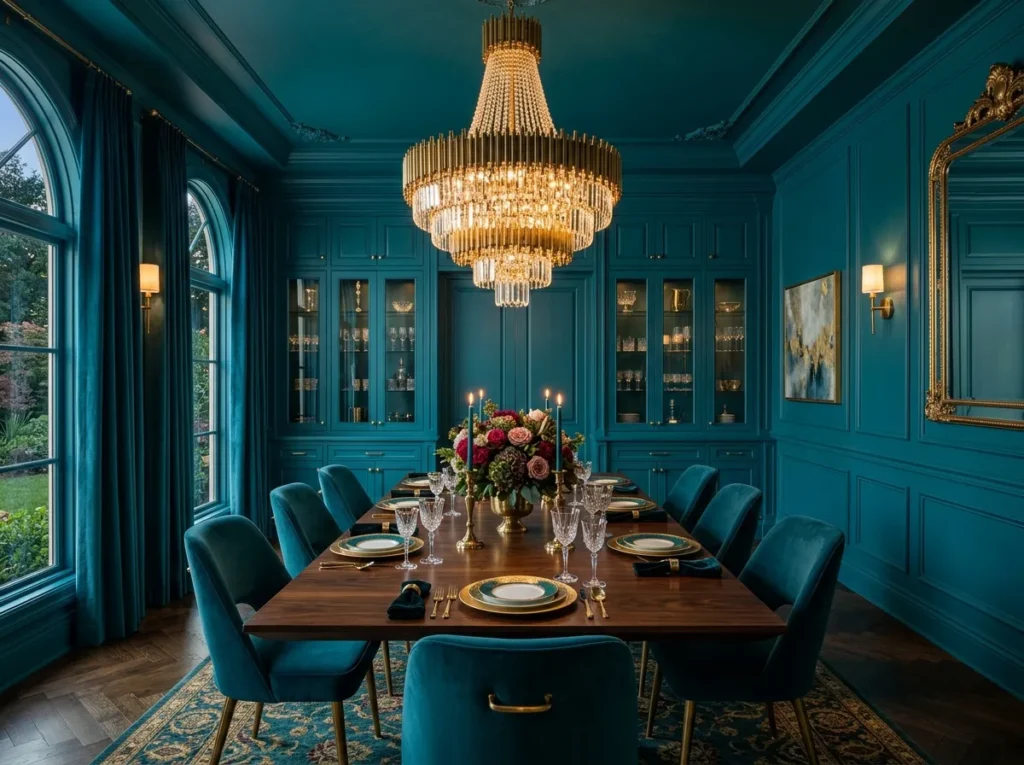
Peacock teal done right is one of the most boutique hotel dining room looks achievable in a home setting. The color is rich enough to feel luxurious without being so dark that it needs aggressive lighting to read correctly.
The brass everywhere instruction is not an exaggeration. Brass pendant lights, brass candlestick holders, brass handles on any cabinetry, even brass picture frames if there is art on the walls. Against peacock teal every piece of warm metal glows in a way that feels genuinely theatrical. White ceramic tableware and simple linen napkins keep the table grounded while the color and metal do their work around it.
9. Warm Raspberry Drench With Dark Wood Furniture
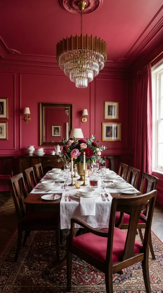
Raspberry sits between pink and red in a place that feels genuinely its own, and as a full drench it creates a dining room that surprises everyone who expected to find it overwhelming. Done right it is sophisticated rather than sweet because the depth of the color removes any association with pale or sugary shades.
Dark walnut or ebonised wood furniture is the pairing that makes raspberry drench work best. The contrast between the warm color and the dark wood creates visual depth. Simple white table linens on the table keep the eye moving rather than getting stuck anywhere. This is a room that photographs extraordinarily well because the color depth creates natural contrast in every shot.
10. Dusty Lilac With Aged Brass and Dried Botanicals
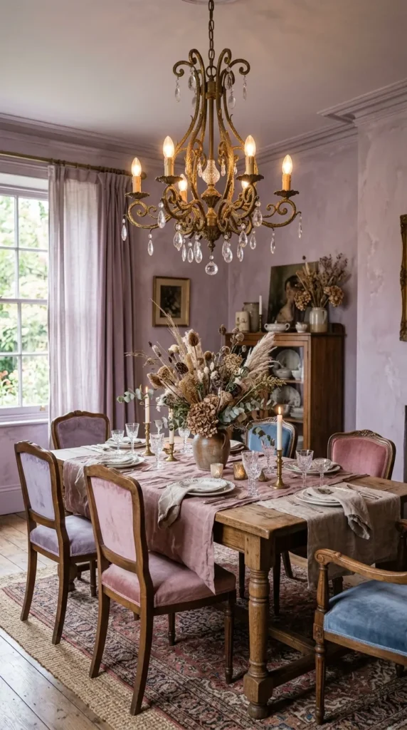
Dusty lilac done right is one of the quietest and most beautiful color drench options available. The muted quality of the color removes any risk of the room feeling childish or precious and replaces it with something genuinely painterly.
The aged brass and dried botanical pairing works because both materials share the same slightly faded quality as the color itself. Nothing in the room is trying to be new or shiny. Everything sits together in a kind of considered imperfection that feels very current without announcing itself. This is a room that people describe as beautiful without immediately being able to explain why.
11. Deep Olive Green Drench With Terracotta Accents
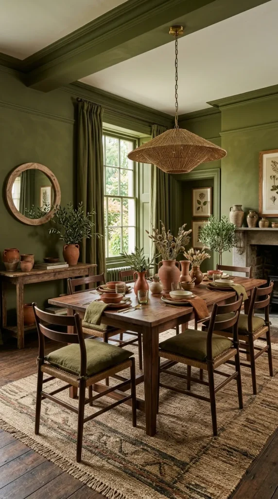
Olive green and terracotta are colors that belong together in a way that feels almost natural, and using olive as the drench color with terracotta coming through in cushions, ceramics, and a rug creates a layered warmth that a single color approach cannot match.
Done right this means the terracotta never competes with the olive for attention. It appears in small doses, a jug here, a cushion there, the color in a piece of art on the wall. The olive drench is still the dominant story and the terracotta is the detail that makes the room feel alive rather than flat. This combination works especially well in dining rooms with wooden floors because the warm wood ties both colors together naturally.
Love dramatic interiors? Discover 15 Moody Dining Room Ideas for elegant and cozy spaces.
12. Midnight Blue Drench With Candlelight as the Only Light Source
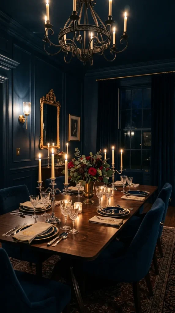
Midnight blue done right at drench level with candlelight as the primary or only light source during dinner is one of the most atmospheric dining experiences possible in a domestic setting. The color absorbs the warm light from candles and reflects it back as something that looks genuinely extraordinary.
The drench here must include the ceiling because a dark blue ceiling with candlelight below it creates a depth that suggests the room continues upward into something larger than it is. Cluster candles of different heights along the center of the table, add two or three wall sconces for background warmth, and let the midnight blue do what it does best which is make everything it surrounds feel more significant than it actually is.
13. Clay and Adobe Drench for Everyday Warmth
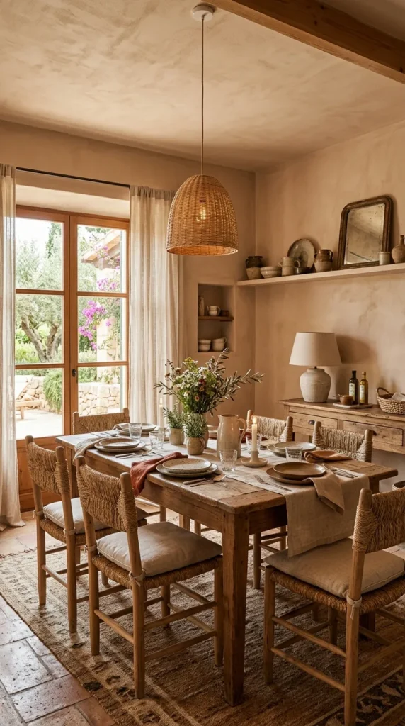
Clay and adobe tones are color drench choices for people who want atmosphere without drama, and that is a completely legitimate thing to want in a room used for breakfast and lunch as well as dinner parties. Done right a clay drench creates a dining room with warmth so consistent that the room feels like it is actively welcoming you every time you walk in.
The material pairings that make clay drench work are the simplest on this list. Unbleached linen, worn wooden furniture, simple ceramic plates without pattern. Nothing that competes, nothing that shouts. The color carries the room and the room in return is pleasant to be in at any time of day under any lighting condition. This is the most liveable drench option for families or people who eat in their dining room daily.
14. Warm Chocolate Brown That Makes the Room Feel Private
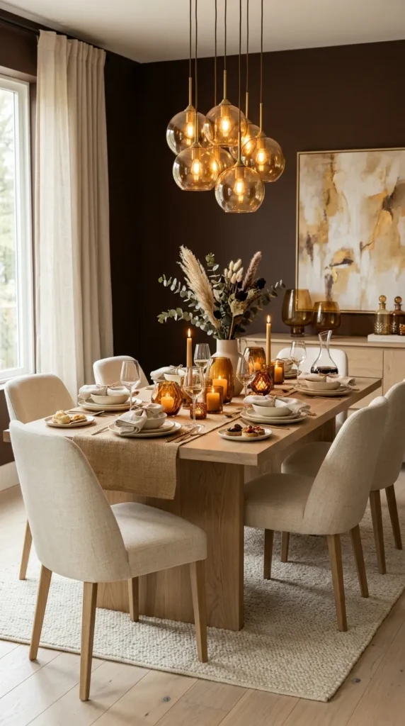
Chocolate brown drenching done right creates a dining room with a quality that is hard to name but easy to feel. The room feels private. Enclosed. Like a space that exists slightly outside the rest of the house. That feeling makes meals taken in it feel more deliberate and special.
The tone must be warm brown rather than cool or muddy brown because warm brown reflects light in a way that keeps the room glowing rather than absorbing. Pair with cream linen, amber glass candleholders, and pale wood and the layering of warm neutrals creates a room with depth that surprises people who expected brown to feel boring.
15. Tonal Drench Using Four Shades of the Same Color
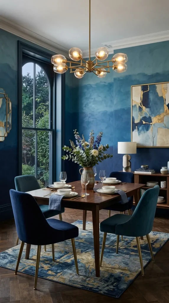
The tonal drench is the most sophisticated approach on this list and when done right it creates a dining room that shifts noticeably as you move through it. Using four shades from the same color family, one per wall, creates full color immersion without any single shade becoming overwhelming.
Done right means arranging the shades so the darkest is on the wall with the least natural light and the lightest is on the wall that receives the most. This creates a natural gradation that feels almost organic. The ceiling goes in the second lightest shade to keep the room feeling open even while being completely color drenched. This approach takes more planning than a single shade drench but creates a result with more visual richness than anything else on this list.
16. Deep Sage Green With Linen Curtains in the Same Family
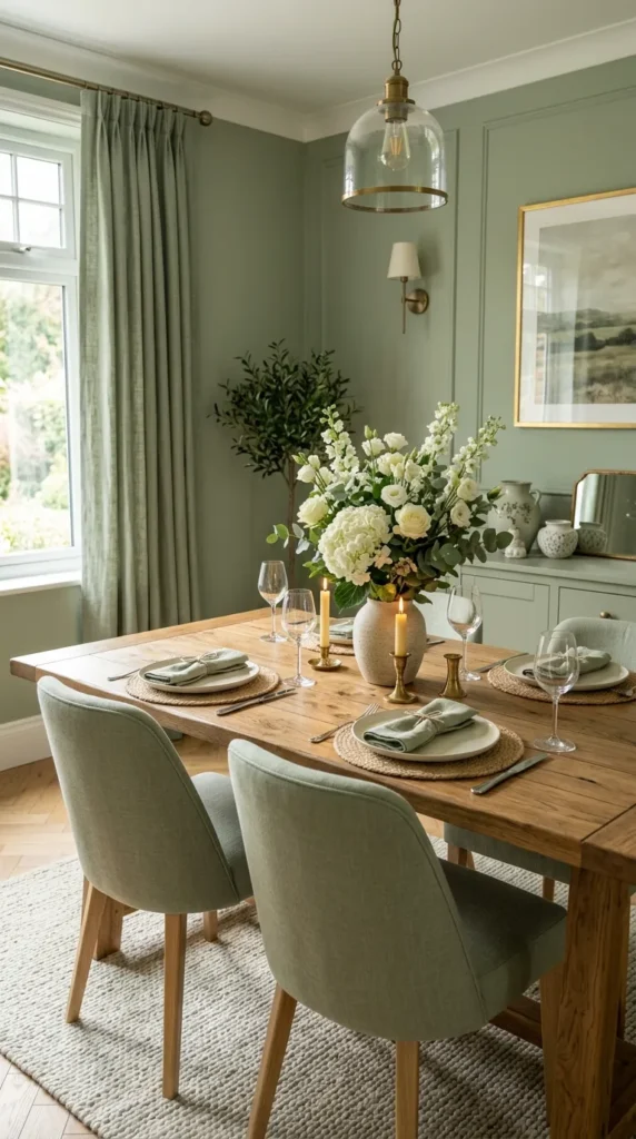
Sage green at drench level is the quieter cousin of forest green and it creates a dining room with a different quality altogether. Where forest green feels rich and established, sage green feels calm and considered. Done right as a full drench it creates a room that feels genuinely restful to eat in.
The linen curtains in a similar sage or warm neutral tone extend the color without repeating it exactly, which adds the kind of subtle variation that prevents a drench from feeling like a paint job rather than a design decision. Simple white flowers in a ceramic vase on the table look extraordinary against sage green walls in a way that takes almost no effort to achieve.
17. Multicolor Drench With One Bold Shade Per Wall
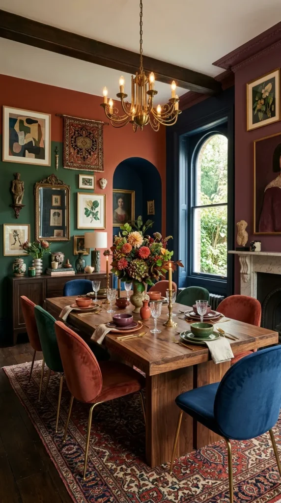
The boldest approach done right uses a completely different color on each wall while keeping all four colors at the same level of saturation so they read as belonging together. This is not four random colors. It is four carefully chosen colors that share the same tonal weight.
Deep terracotta, forest green, midnight blue, and warm plum can share a dining room if every shade is equally rich and deeply saturated. Done right the result feels maximalist in the best sense, generous with color without being chaotic. The ceiling goes white or very pale to give the eye somewhere to rest. The furniture stays simple and natural so the color story on the walls is the undisputed focus of the room. This is color drenching at its most ambitious and when it works it works completely.
Final Thoughts
Every dining room on this list works for the same reason. Someone made a decision and then followed it all the way through. They painted the ceiling. They included the trim. They chose furniture that worked within the color instead of fighting it. Half commitment is what makes color look risky. Full commitment is what makes it look right.
Pick the color from this list that you have been thinking about since you first saw it. Paint the ceiling the same shade. Extend it to the trim. Then stand in the room and notice what happens to the space when color is allowed to do its job completely.