18 Burgundy Room Ideas
Burgundy has a way of making a room feel instantly more refined. It carries the warmth of red without the intensity, and the depth of brown without feeling flat. Used thoughtfully, this rich wine toned color can turn an ordinary space into something that feels curated, confident, and quietly luxurious.
This guide brings together eighteen distinct ways to bring burgundy into your home, spanning bedrooms, living rooms, kitchens, and everything in between. Each idea approaches the color differently, so you can find the one that matches your existing style rather than forcing a single formula into every room.
1. Burgundy Accent Wall
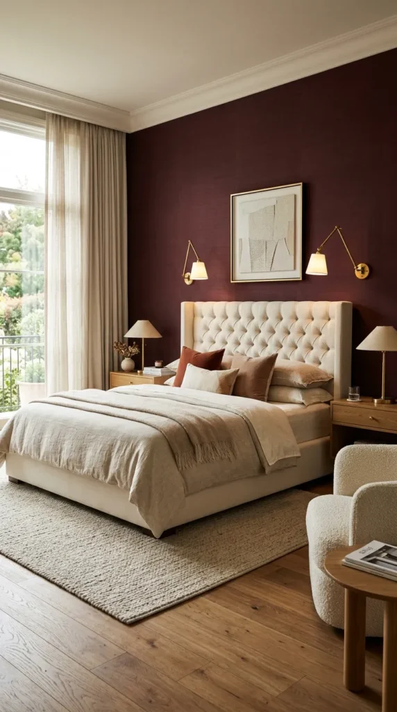
A single accent wall painted in deep burgundy anchors a room without overwhelming it. Choosing the wall behind a bed or sofa gives the color a natural frame, letting lighter furniture and trim balance the richness. It is one of the simplest ways to test the color before committing further.
Pair the wall with brass or gold hardware nearby to echo the warmth already present in the paint. Keeping the remaining walls a soft white or warm gray allows the burgundy to feel intentional rather than heavy, especially in smaller rooms with limited natural light.
2. Deep Burgundy Velvet Sofa
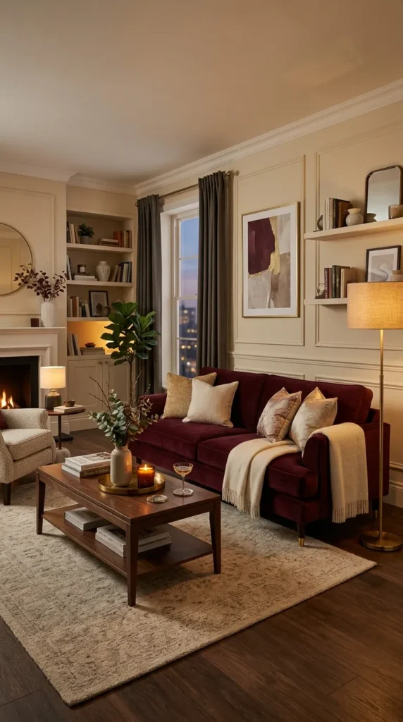
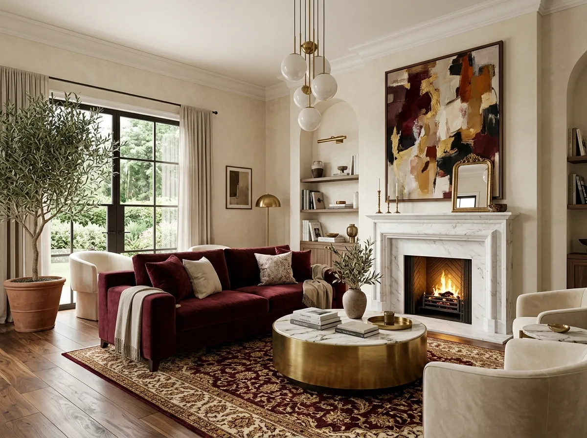
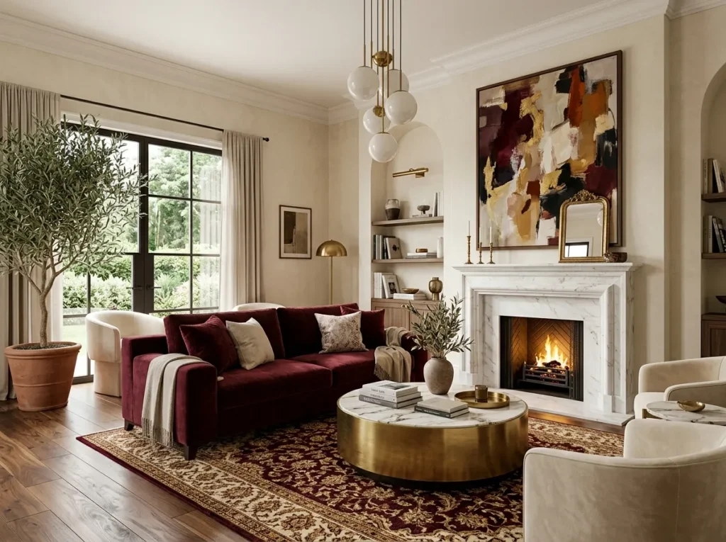
A velvet sofa in burgundy becomes the centerpiece of any living room almost immediately. The fabric catches light differently across its folds, giving the color depth that flat paint cannot quite achieve. This piece works particularly well as the sole bold element in an otherwise neutral space.
Surround the sofa with cream or camel toned accents to let the velvet stand out fully. Wooden legs in a warm walnut finish tie the piece together nicely, giving the room a slightly vintage, well loved feeling that still reads as current.
3. Burgundy and Gold Living Room
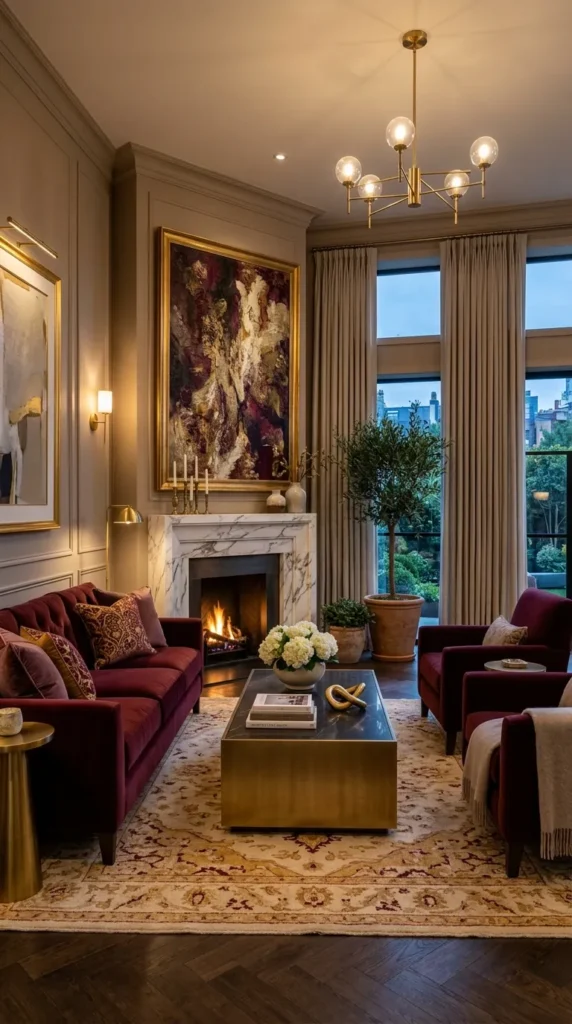
Gold accents bring out the richness hiding inside burgundy, making this pairing feel almost regal. Small touches like picture frames, lamp bases, or curtain rods in brushed gold elevate a burgundy sofa or rug without requiring a full room overhaul.
This combination photographs beautifully in evening light, when warm bulbs enhance both tones simultaneously. Keeping the gold used sparingly, rather than across every surface, prevents the room from feeling overly ornate and keeps the overall look grounded and livable.
4. Burgundy Bedroom Bedding
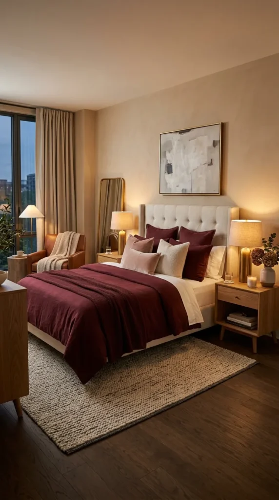
Swapping standard white bedding for a burgundy duvet instantly deepens the mood of a bedroom. The color reads as cozy rather than dark, especially when paired with soft textures like linen or brushed cotton. This is one of the easiest and most affordable ways to try the color at home.
Layering in a few blush or cream throw pillows softens the overall palette and prevents the bed from feeling too heavy. This approach also transitions easily between seasons, since burgundy feels equally at home in autumn and in the depth of winter.
Pair rich burgundy tones with the perfect lighting by exploring 12 Bedroom Lamp Ideas for a warm and inviting atmosphere.
5. Burgundy Curtains and Drapery
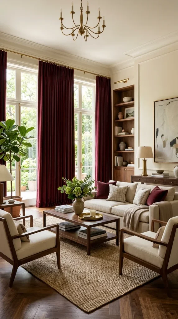
Floor length curtains in burgundy add drama to any window without permanently altering the room. The fabric’s weight and color combine to frame natural light beautifully, giving even simple windows a more finished, tailored appearance. Linen or velvet both work well depending on the desired formality.
This idea suits rooms that already lean neutral, since the curtains alone can carry the color story for the entire space. Choosing a slightly lighter burgundy for sheer layers underneath keeps the room from feeling closed off, even with the deeper drapery on top.
6. Burgundy Dining Room Walls
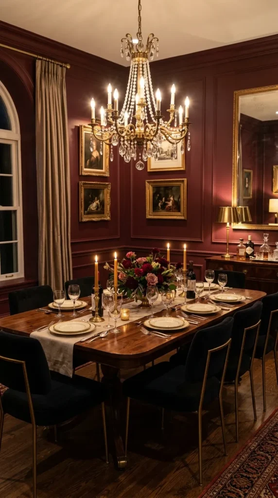
Dining rooms benefit from bold color choices since they are typically used during evening hours when warm tones feel most flattering. Painted burgundy walls, paired with a dark wood table, create an intimate atmosphere well suited to dinner parties and quiet family meals alike.
Adding a statement chandelier in aged brass or black iron completes the look without competing with the wall color. This combination tends to feel timeless rather than trendy, making it a strong choice for households that prefer decor with real staying power.
7. Burgundy Leather Armchair Corner
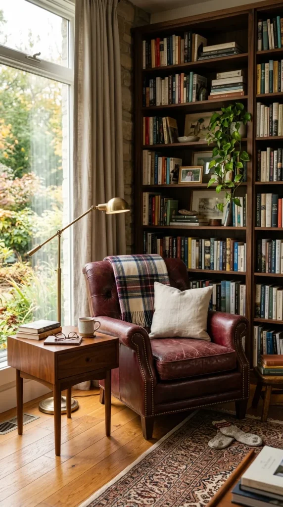
A single burgundy leather armchair, placed near a window or in a reading nook, brings personality into a corner that might otherwise go unused. Leather ages beautifully over time, developing character that fabric alternatives simply cannot replicate in quite the same way.
Pairing the chair with a small wooden side table and a warm reading lamp turns the corner into a genuine destination within the room. This idea works particularly well in homes where a full burgundy room feels like too large a commitment.
8. Burgundy and Cream Color Palette
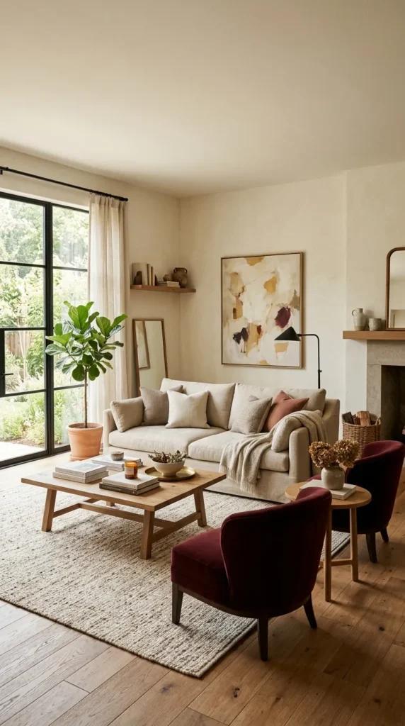
Cream softens burgundy considerably, creating a palette that feels warm and approachable rather than formal or heavy. This combination works beautifully across nearly any room type, from bedrooms to home offices, since cream provides enough visual breathing room for the burgundy to shine.
Using burgundy for roughly a third of the room, through furniture or textiles, while cream handles the walls and larger surfaces, keeps the balance feeling natural. This ratio tends to be the easiest starting point for anyone new to working with deeper color palettes.
9. Burgundy Kitchen Cabinets
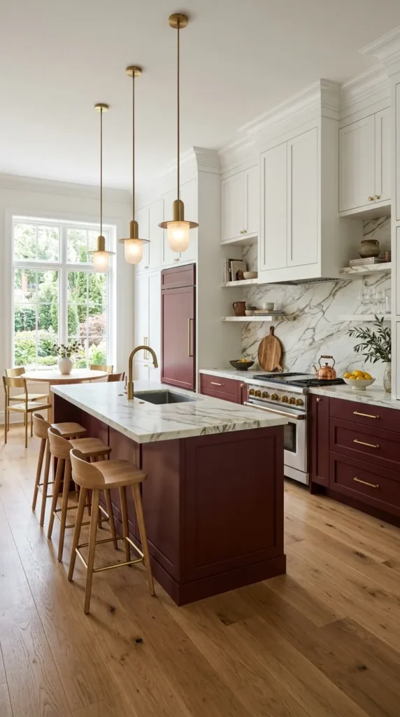
Lower cabinets painted in burgundy bring unexpected richness into a kitchen, especially when paired with light countertops and white upper cabinetry. This approach keeps the space feeling open while still introducing real personality into what is often the most neutral room in a home.
Brass or matte black hardware finishes the look nicely, echoing tones already present elsewhere in the kitchen. This idea suits homeowners who want their kitchen to feel a bit more like a considered design choice rather than a purely functional space.
10. Burgundy Home Office Design
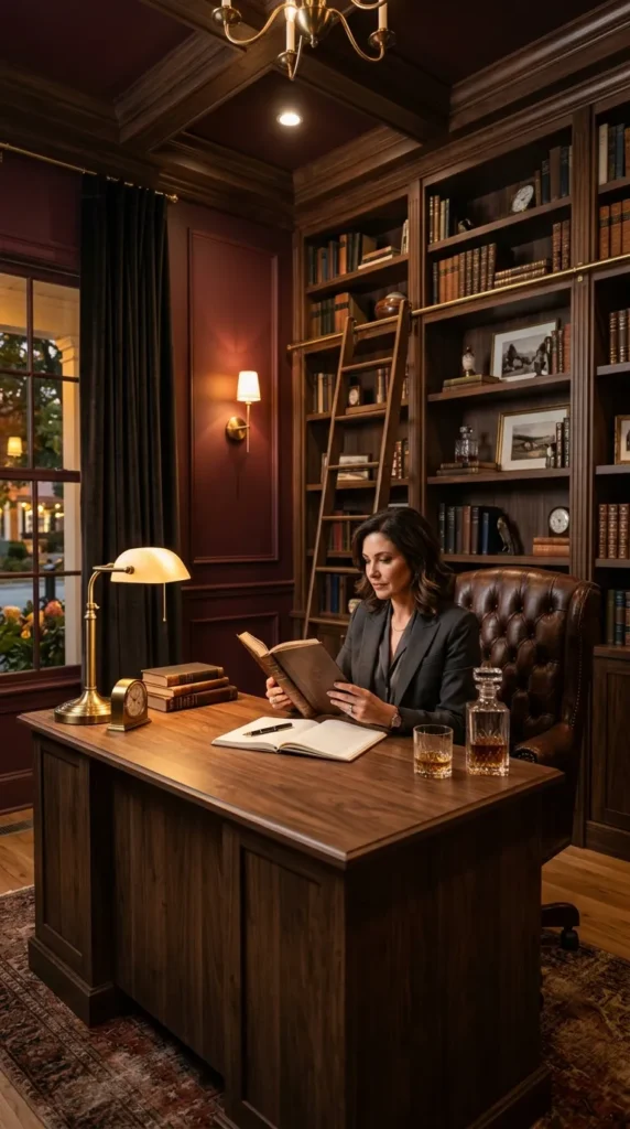
A home office painted in burgundy creates a focused, almost library like atmosphere well suited to concentration. The color’s depth tends to feel grounding rather than distracting, making it a surprisingly practical choice for a room meant for sustained work.
Pairing the walls with a dark wood desk and simple brass reading lamp completes the effect without adding unnecessary visual noise. Built in shelving painted the same burgundy tone as the walls creates a cohesive, enveloping feel throughout the entire space.
11. Burgundy Bathroom Tile Accents
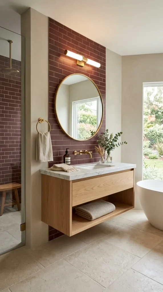
Burgundy tile, used sparingly as a border or backsplash, brings warmth into a room that is often dominated by cool, hard surfaces. This approach avoids the higher cost of tiling an entire bathroom while still delivering a strong visual impact where it matters most.
Pairing the tile with brushed brass fixtures and warm white walls keeps the overall palette balanced and inviting. This idea works particularly well in powder rooms, where a bolder design choice feels appropriate given the smaller, more private nature of the space.
Complete your color scheme with these 13 Bedroom Wall Decor Ideas for a beautifully finished bedroom.
12. Burgundy Rug Foundation
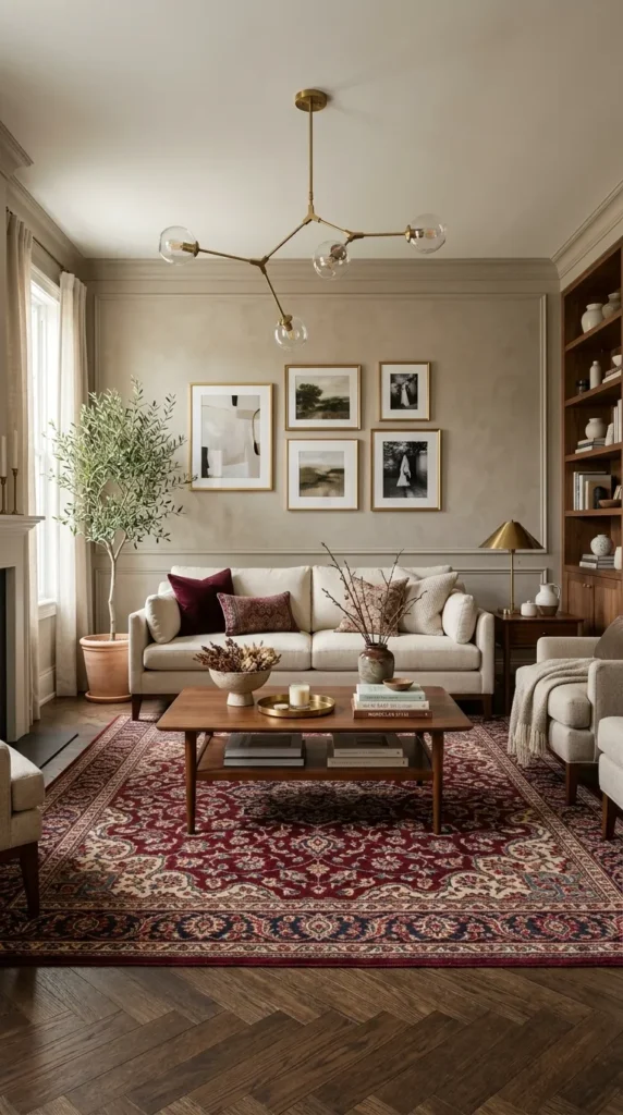
A burgundy area rug can anchor an entire room’s color palette without requiring any permanent changes to walls or furniture. Patterned options, like traditional Persian style rugs, layer additional texture and history into the space, while solid burgundy rugs offer a cleaner, more modern foundation.
This idea works particularly well for renters, since the rug alone can carry the burgundy theme while everything else remains neutral and flexible. Choosing a rug with some cream or navy woven through the pattern also makes future color changes easier down the line.
13. Burgundy and Navy Combination
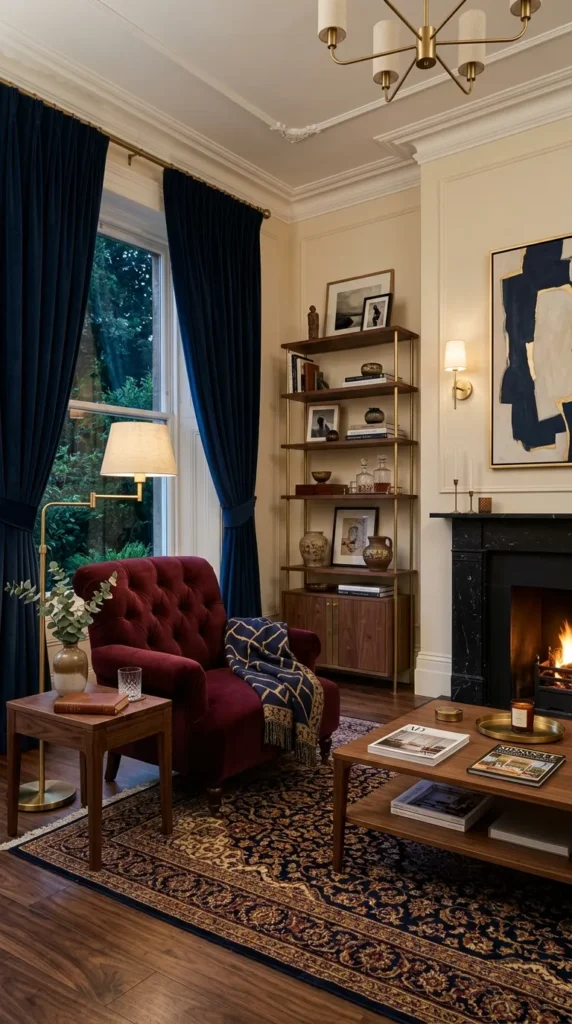
Navy and burgundy share a similar depth, making them natural partners within the same room. This pairing feels sophisticated and slightly masculine, working particularly well in studies, dining rooms, or bedrooms designed for older children and teenagers who want a more grown up palette.
Balancing the two colors through separate furniture pieces, rather than mixing them directly, keeps the room feeling organized. A burgundy armchair paired with navy curtains, for example, allows both colors to remain distinct while still feeling like part of the same considered design.
14. Burgundy Statement Ceiling
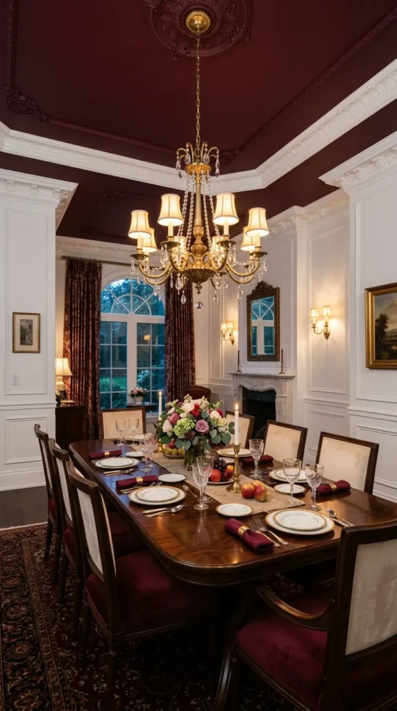
Painting a ceiling burgundy instead of the standard white creates an unexpected and memorable design moment. This approach works especially well in rooms with detailed molding or architectural interest, since the color draws attention upward toward those existing features.
Keeping the walls a lighter neutral tone prevents the room from feeling too enclosed, letting the ceiling do the visual heavy lifting. This idea suits dining rooms and bedrooms particularly well, where a dramatic overhead moment feels appropriate rather than overwhelming.
15. Burgundy Floral Wallpaper
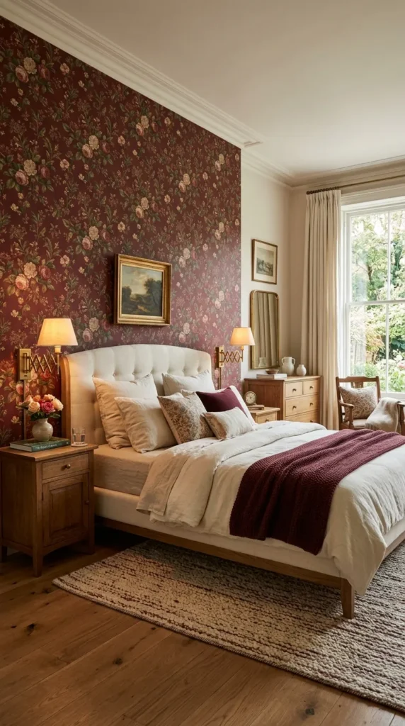
Floral wallpaper featuring burgundy tones brings pattern and color into a room simultaneously, without requiring separate decisions about each element. Vintage inspired botanical prints tend to pair especially well with this color, since the deep red naturally echoes the tones found in real flowers and foliage.
This idea works beautifully as a single accent wall for those hesitant to commit to a full room. Pairing the wallpaper with simple, solid colored furniture keeps the pattern as the clear visual focus rather than competing with too many other busy elements nearby.
16. Burgundy Entryway Design
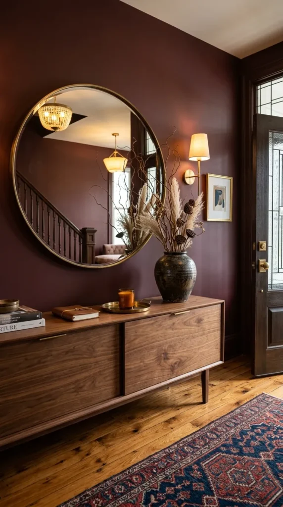
An entryway painted burgundy sets the tone for a home from the very first step inside. Because entryways are typically smaller and used only briefly, they are an ideal place to experiment with a bolder color choice that might feel like too much elsewhere.
Adding a console table in dark wood, paired with a round mirror in an aged brass frame, completes the look nicely. This approach creates a memorable first impression while still allowing the rest of the home to maintain a lighter, more neutral palette throughout.
17. Burgundy and Emerald Green Pairing
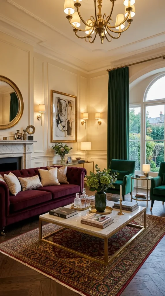
Emerald green and burgundy both carry deep, jewel toned richness, making them a striking combination when used together. This pairing feels luxurious and slightly bold, working particularly well in formal living rooms or dining spaces meant to impress.
Using one color as the dominant tone, through walls or large furniture, while the other appears in smaller accents like pillows or artwork, keeps the combination feeling intentional. This balance prevents the room from feeling like two competing color schemes layered on top of one another.
18. Burgundy Minimalist Bedroom
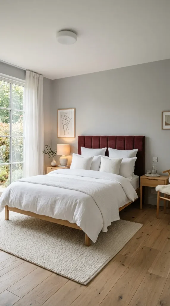
For those who prefer a more restrained approach, a single burgundy element within an otherwise minimalist bedroom can be highly effective. A burgundy headboard or a single piece of abstract artwork introduces the color without disrupting the room’s overall simplicity and calm.
Keeping every other surface white, gray, or natural wood allows the burgundy to feel like a deliberate design statement rather than an afterthought. This approach suits smaller bedrooms particularly well, since it introduces personality without adding visual clutter to a limited amount of space.
Final Thoughts
Burgundy is one of those colors that rewards a thoughtful, considered approach rather than an all at once transformation. Whether you introduce it through a single accent wall, a piece of furniture, or a full room commitment, the color consistently brings warmth and sophistication wherever it appears throughout a home.
The eighteen ideas above offer a range of entry points, from small and affordable to bold and permanent. Choosing the one that best fits your existing space and comfort level ensures the result feels authentic to your home, rather than like a passing trend borrowed from somewhere else entirely.